Google sheets comprise a great number of features and tools that are used to illustrate, depict, interpret and decipher important financial stocks, stock exploration and aspects of the trade market, amongst these features is the Candlestick Chart.
In this tutorial, we are going to discuss what a candlestick chart is and how to create one on your Google Sheet.
What is a Candlestick Chart?
A candlestick chart is a graph that illustrates the opening and closing values, the difference in the values and the total gain or loss made over some time on a particular commodity. This chart comprises four major parameters that must be included to form an accurate candlestick chart. They are:
- Low value
- Open value
- Close value
- High value
These values determine the movement of data on the chart and depict the gain or loss of the selected stock over some time.
The chart comprises candle-shaped bars that rise and fall across the chart. Some bars are empty while some are full. The empty bars depict the loss in value of the stock and occur when the open value is higher than the close value.
Why Use A Candlestick Chart?
Unlike other charts used for graphical representation, the candlestick chart provides a full copy of stock operations over time that can be understood at first glance.
They are also significant in financial aspects. They illustrate data and stock sales and counts pulled directly from Google finance.
How to Make a Candlestick Chart In Google Sheets.
Now we are going to discuss how to prepare the data used to create a candlestick chart and how to interpret the bars on the chart.
Preparing The Data.
When you already have a dataset you want to work with, you would perform the necessary preparations to avoid errors in the placement of bars.
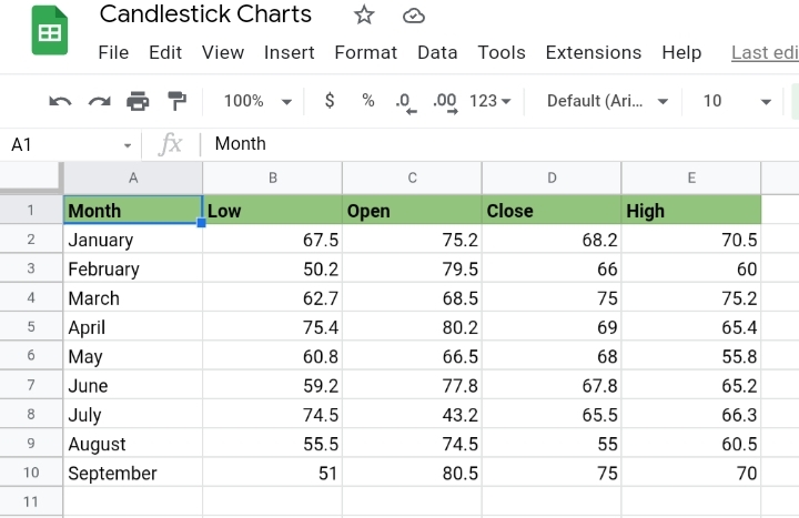
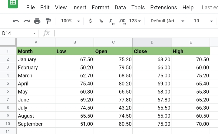
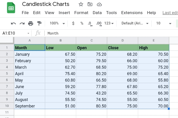
Step 1: Ensure the headers of the data take the following order.
Month – Low – Open – Close – High
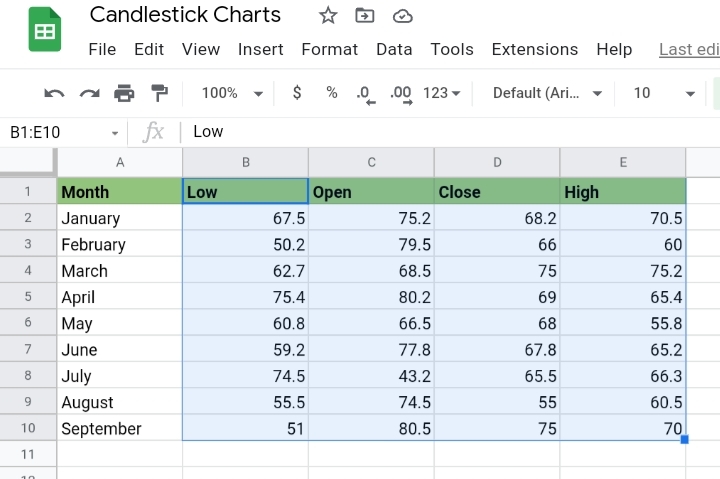
Step 2: Select the cell range B2 to E10. Exclude the column containing the months in the worksheet.
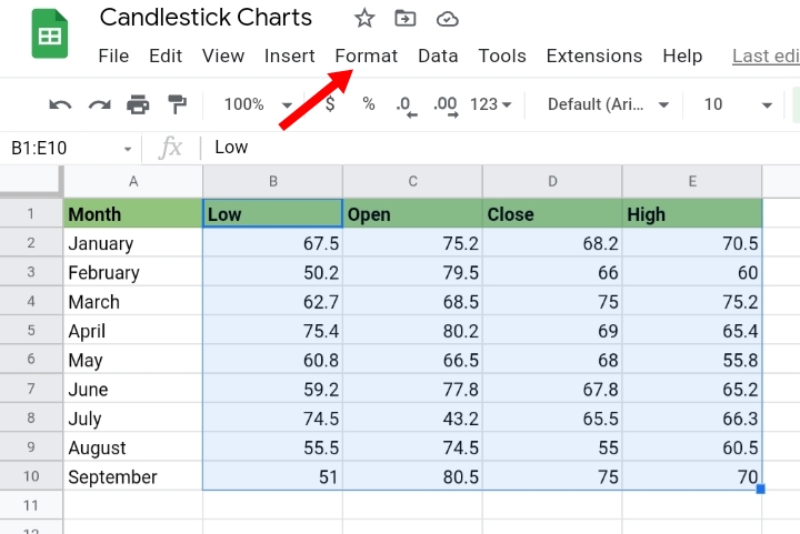
Step 3: Click on Format on the toolbar.
Step 4: Click on Number.
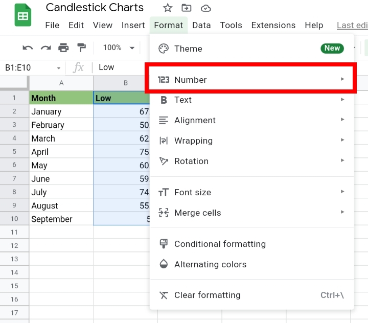
Step 5: Select Financial.
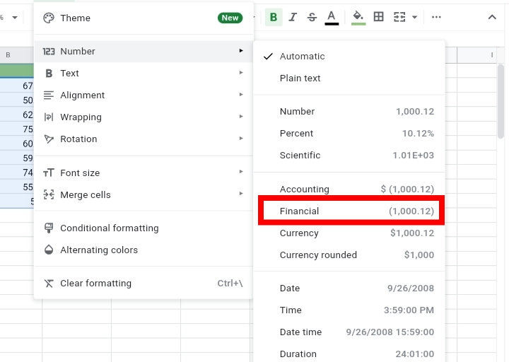
This formats the numerical values on the worksheet to decimal figures.
Now, we format the text in the data.
Step 6: Select the dates in column A.
Step 7: Select Format on the toolbar.
Step 8: Click on Number.
Step 9: Select Plain Text.
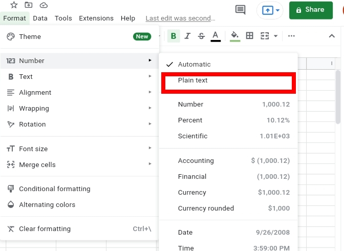
This formats the texts as any special characters are removed.

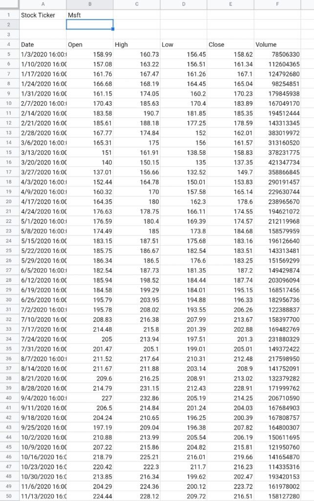
Also, if you don’t have a dataset ready to work on, you can import data using the GOOGLEFINANCE function. This function imports data from the Google Finance website to your Google Sheet by using the formula below.
=GOOGLEFINANCE(cell reference, “all”, ” start date”, “end date”, “weekly or daily”)
Assuming you want to import the stock analysis of Microsoft from January 1st 2021 till December 31st 2021 every week, we input the formula like this.
=GOOGLEFINANCE(B1, ” all”, “1/01/2021″, ” 31/12/2021″, “weekly”)
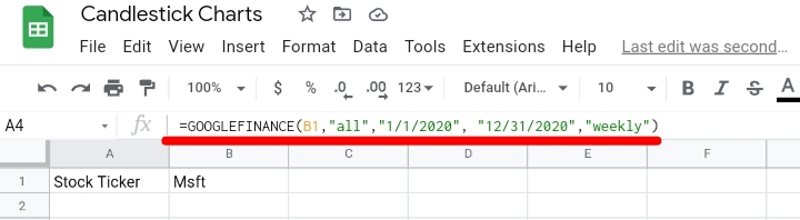
Click Enter and the total stock analysis of the Microsoft stock sold weekly is displayed on the worksheet.
Creating the Candlestick Chart.
The data has been prepared successfully. We need to create a candlestick chart to illustrate the data.
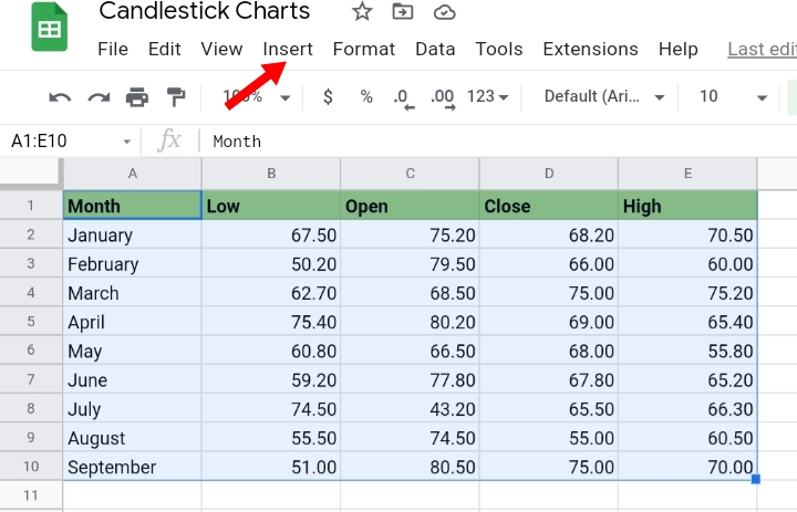
Step 1: Select the whole data on the worksheet.
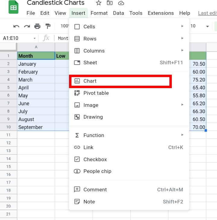
Step 2: Click on Insert on the toolbar.
Step 3: Click on Chart.
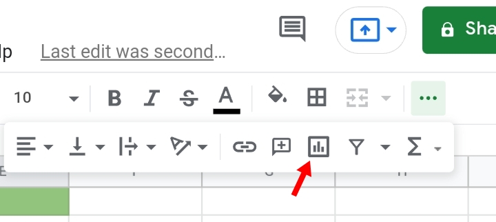
Alternatively, you can click on the Insert Chart icon on the toolbar.
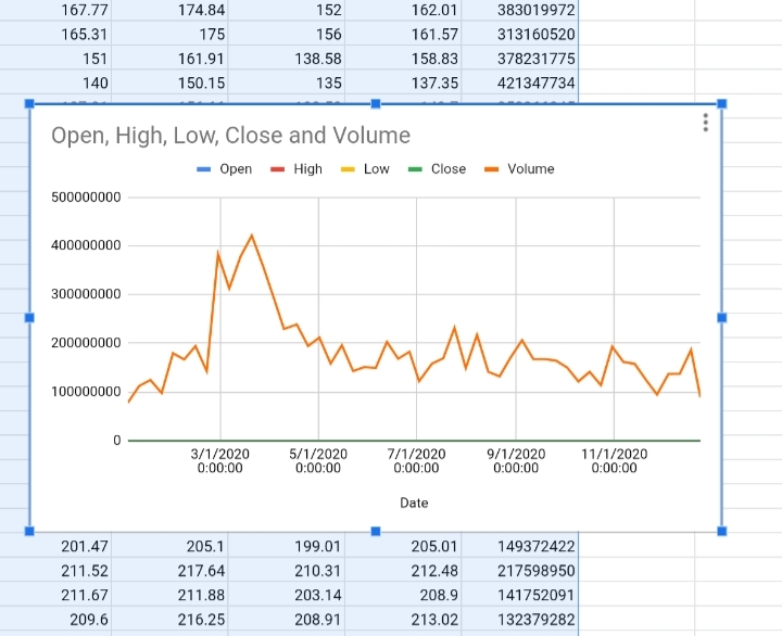
Step 4: Google Sheets guesses the kind of chart you need and automatically produces a Candlestick chart.
Google sheets sometimes create a Line chart.
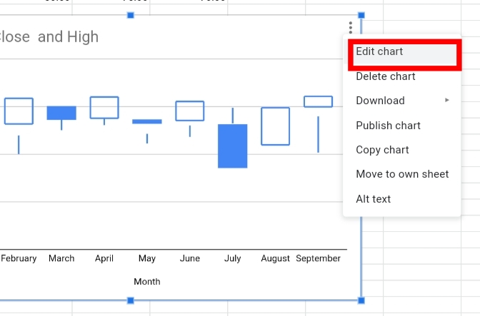
If it does, click on the three dots on the top right of the chart.
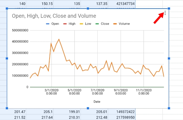
Click Edit chart.
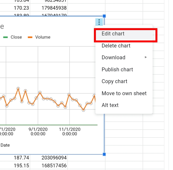
A new tab titled Chart Editor is opened on the right side of the worksheet.
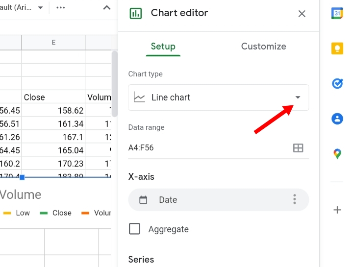
Under Setup, click on Chart type and Select the correct chart format you need.
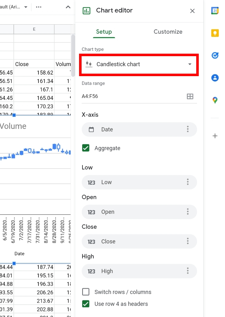
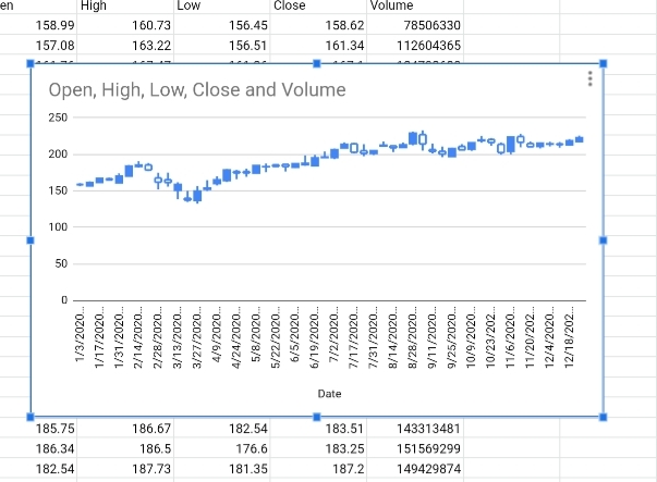
A candlestick chart has been created successfully.
Interpreting the Candlestick Chart.
Sure you have created your candlestick chart, but do you understand its representation and what the candlestick bars depict? Here, we are going to explain how to observe and note the patterns and trends in the movements and appearances of the candlesticks.
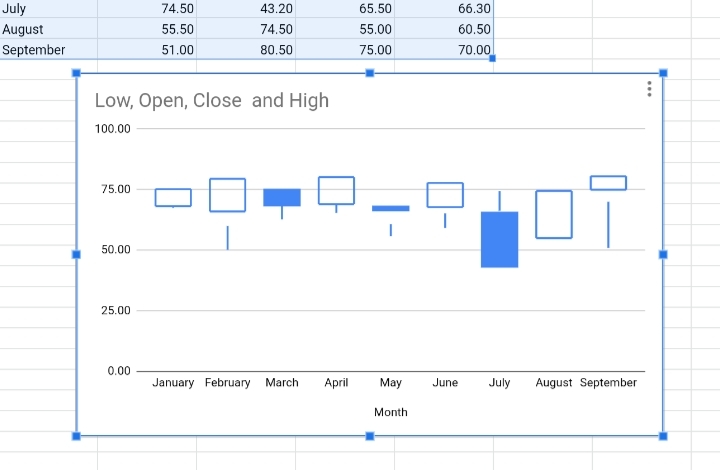
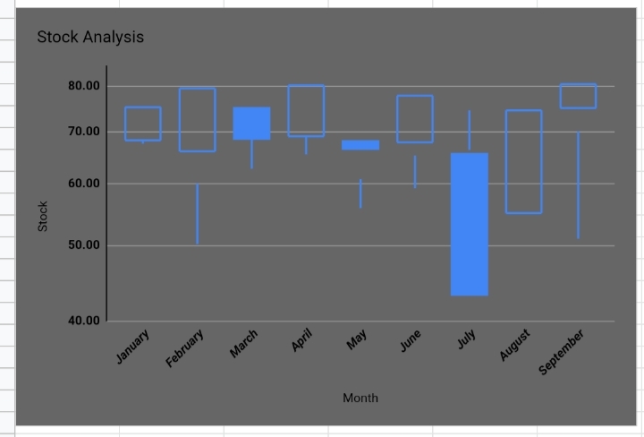
In a candlestick chart, each candlestick represents the distance between the open and close values. As said earlier, when the candlestick is filled or colored blue, the closing value is less than the opening value while if the candlestick is empty or white, the closing value is greater than the opening value.
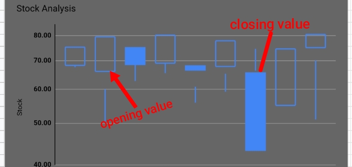
The base of the candlestick indicates the opening value while the top of the candlestick indicates the closing value.
On top of these candlesticks, are lines or wicks. The line placed on top indicates the highest price while the line below signifies the lowest price in that week or month.
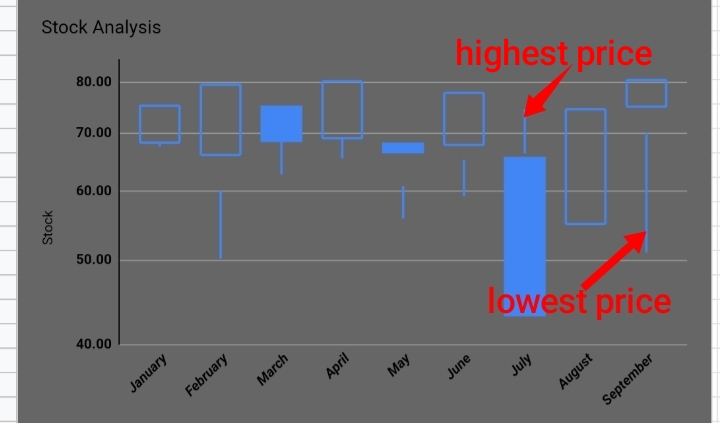
Also, if a short wick is on top, this means the closing value is close to the high value for the month. If the wick is long, there is a large difference between the two values.
An upward movement of the filled or blue candlesticks indicates an increase in the stock values while a downward movement of the empty or white candles signifies a decrease in the stock values.
Customizing the Candlestick Chart In Google Sheets
In similar apps like Microsoft Excel, the filled bar is colored green while the empty candlesticks are colored red. Google sheets are unable to change the colors of the candlesticks but they can customize all other features and components of the chart.
Changing Chart Style.
Here, we can improve the aesthetics and fonts of the details in your candlestick chart.
Step 1: Click on the three dots on the candlestick chart.
Step 2: Select Edit chart.
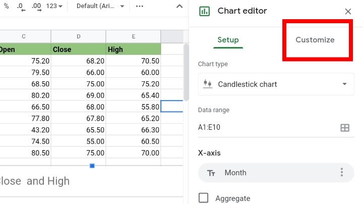
Step 3: The Chart Editor tab is open. Click on Customize.

Step 4: Click on the drop-down arrow near the Chart Style title.
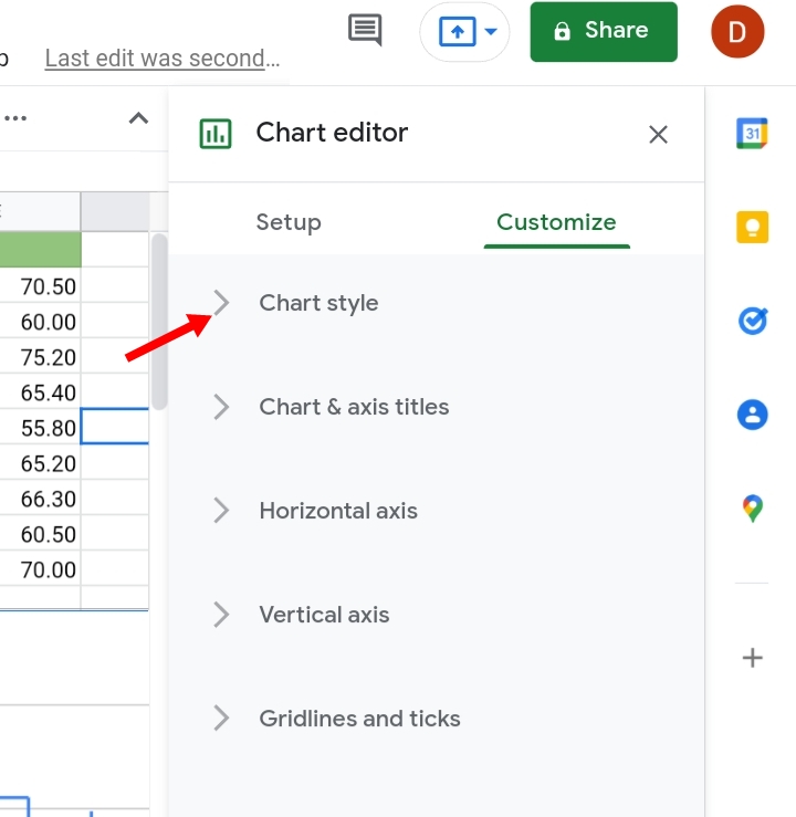
Step 5: Under this tab, you can customize the background color, font size and style of the details on the chart.
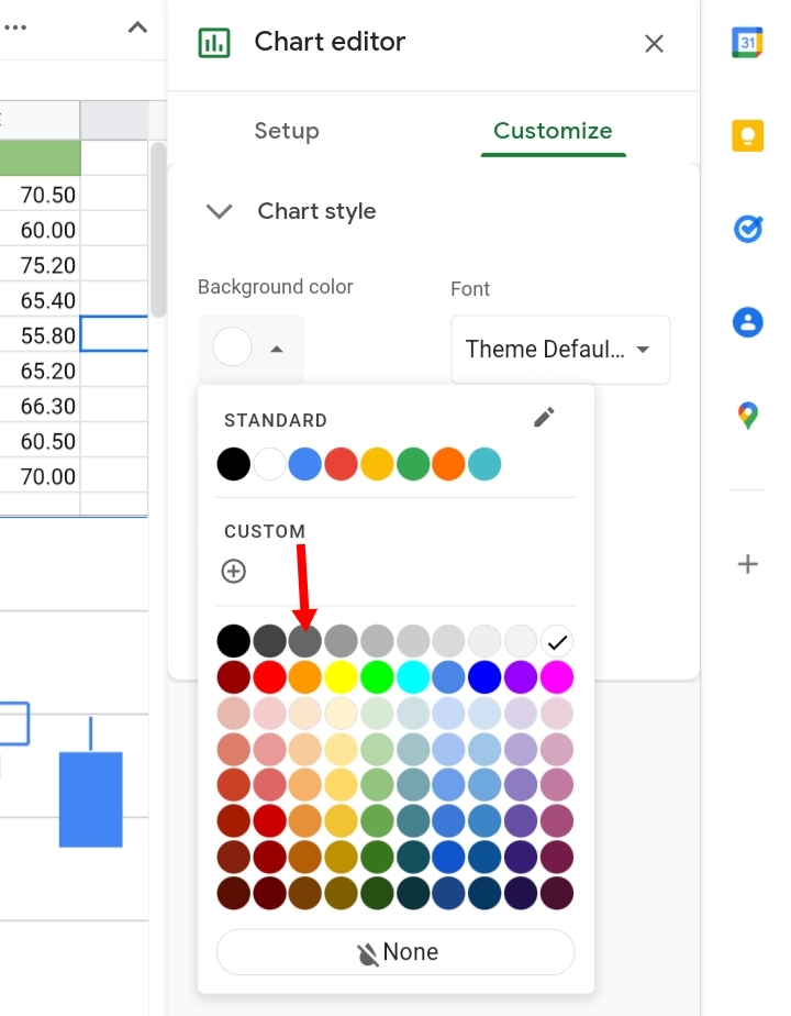
We changed the background color to gray and changed the font style on the chart.
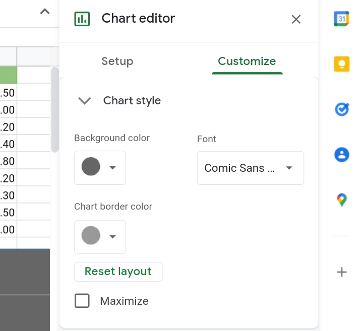
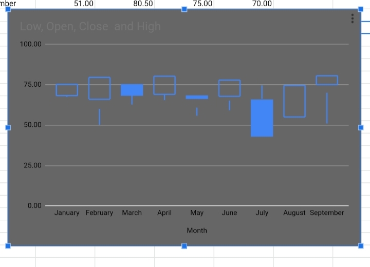
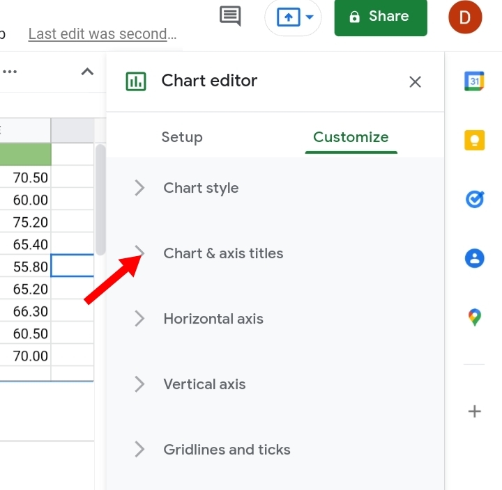
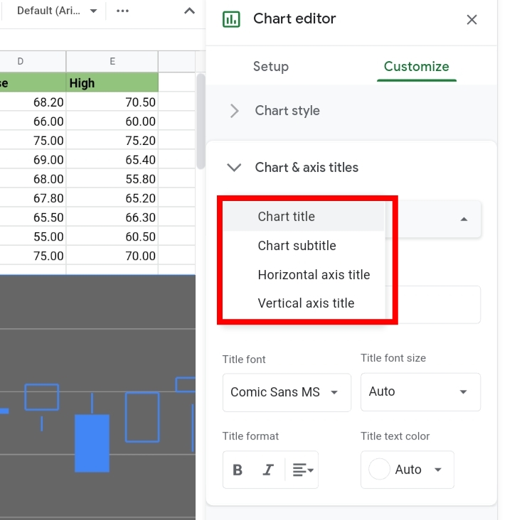
Chart and Axis Titles.
Here, we can customize and edit the chart titles, subtitles and axis titles of the candlestick chart.
Step 1: Under the Customize tab, click on Chart and Axis titles.
Step 2: We changed the titles from Low, Open, Close and High to Stock Analysis.
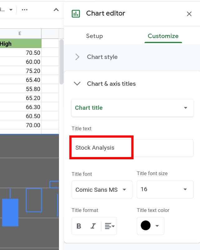
Step 3: The chart subtitle and axis titles can be changed too.
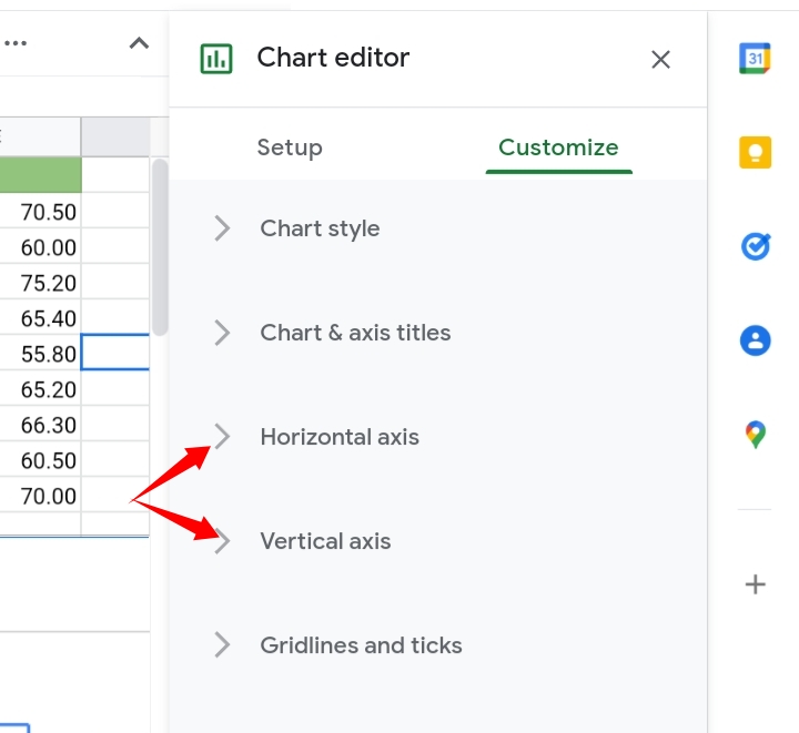
Horizontal and Vertical Axes.
Under this section, you can change the range of the vertical or y-axis and horizontal or x-axis. You may want to exclude some parts of the data so that the candlesticks become bigger.
Step 1: Click on Customize under the Chart Editor.
Step 2: Click on the arrow close to the Horizontal and Vertical Axis title.
Step 3: For instance, you can allocate the values from a hundred to a thousand. You would type in the minimum and maximum values for the y-axis as 40 and 85 respectively, based on the data used.
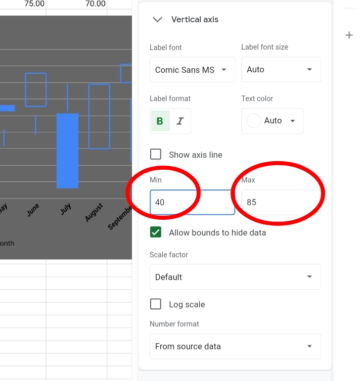
The candlestick chart seems bigger and longer now.
You can also change the font size and style of the details on the horizontal or vertical axis.
Change the font format to be bold, italicized, underlined, degree of slant, etcetera.

Final Thoughts:
Candlesticks charts are a great way of representing data graphically. And now, you can create one on your data with your data or by importing data from Google Finance and also customize your chart however you want it to look.
I hope you enjoyed this tutorial and that it will be beneficial to you. Thanks for reading.


