What is a Pie Chart?
A pie chart is a type of graph displayed in a circular form and is divided into sectors each indicating proportions that are equal to fractions of the whole chart. A pie chart is majorly used to illustrate statistical values as percentages.
They aid comparisons between two sets of values in the chart but might be hindered when comparing large amounts of data. We can also create a pie chart for values inputted on a worksheet.
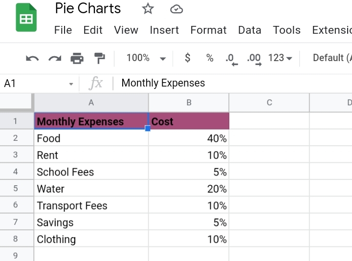
In this tutorial, we are going to illustrate how to create and edit a pie chart to your taste using the sample worksheet below.
How to Create a Pie Chart in Google Sheets
When we want to illustrate values from our datasets graphically, a chart is used. There are different types of charts used for illustrating data.
- Bar or Column Charts are charts containing rectangular bars whose lengths are proportional to the data represented.
- Line Graphs: are graphs used to illustrate the continuous change of data over some time in lines.
- A histogram is a bar chart representing a frequency distribution where the rectangular bars are joined together.
- Pie charts.
All the listed graphs can be created using Google sheets, but we are primarily focusing on how to create a pie chart.
When creating a pie chart, the data are divided into categories or titles and numerical values. By following the steps noted below, we can create a pie chart with ease.
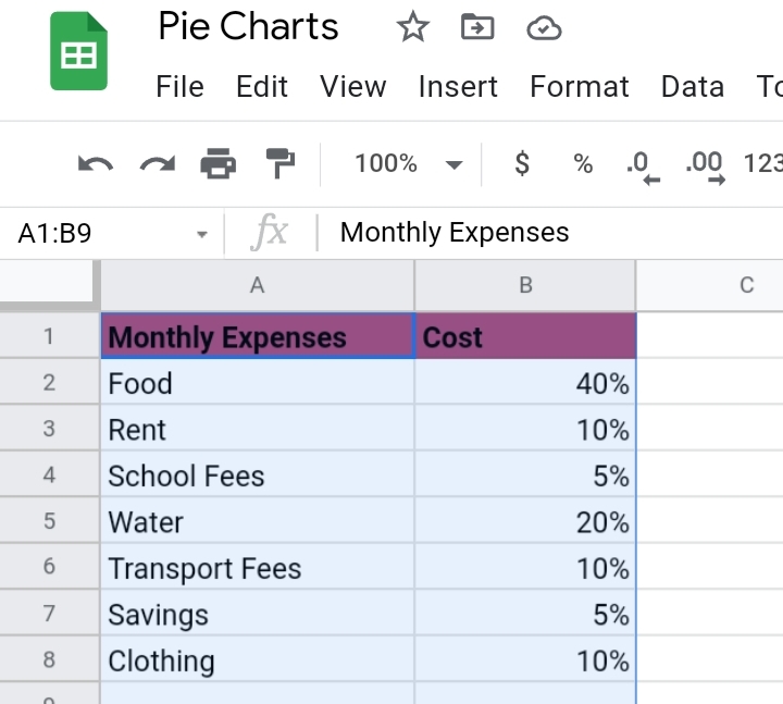
Step 1: Select the values or cell range you want to be portrayed on the chart.
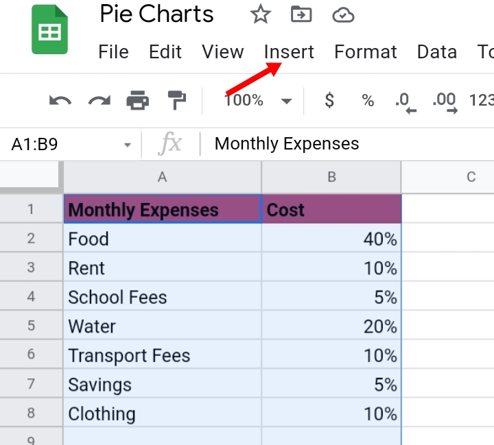
Step 2: Click Insert.
Step 3: Click on Chart.
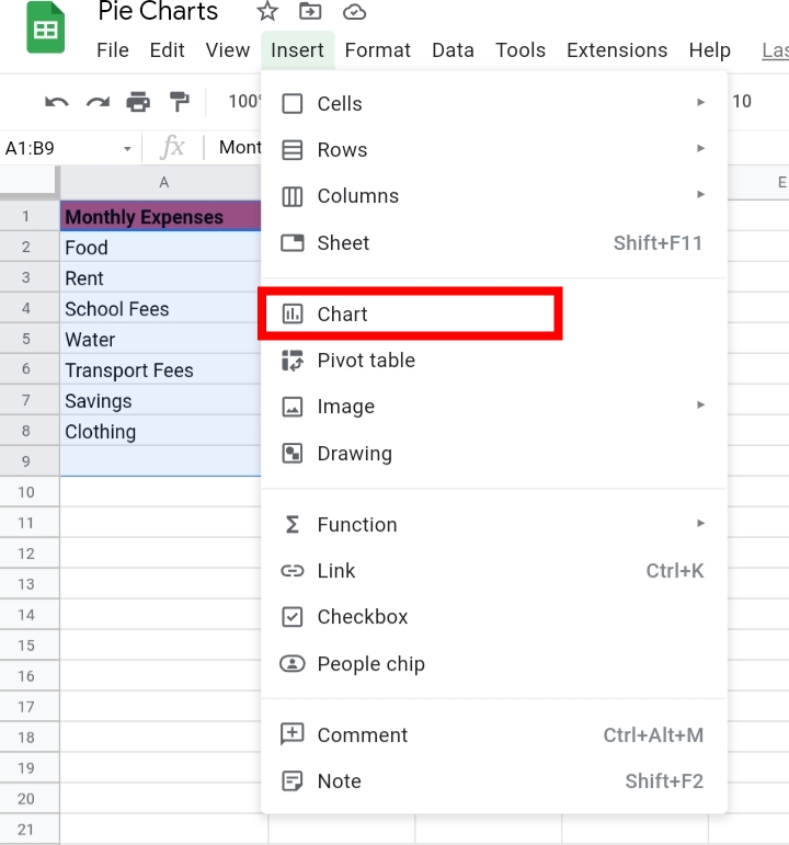
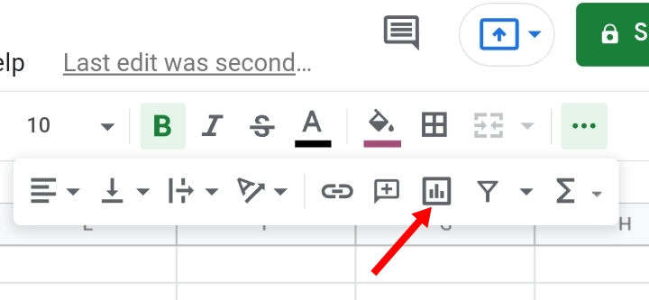
You can also create a chart by clicking on the Insert Chart icon here.
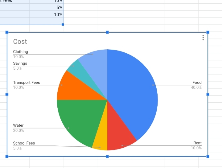
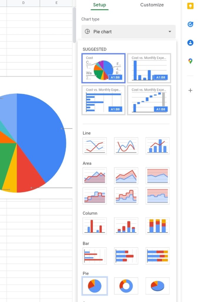
Step 4: Google sheets automatically guesses what type of chart you want to use, based on your data and creates a custom pie chart for you. On rare occasions, Google sheets might create a bar chart for you. This can be changed by editing the chart.
Editing a Pie Chart In Google Sheets
Now that your pie chart is created, Google sheets would not add some details and titles to the custom chart. It’s up to you to edit your pie chart the way you want it to look.
Also, in case you were given a bar chart or any other chart that is different from the pie chart, you can change the given graph to a pie chart.
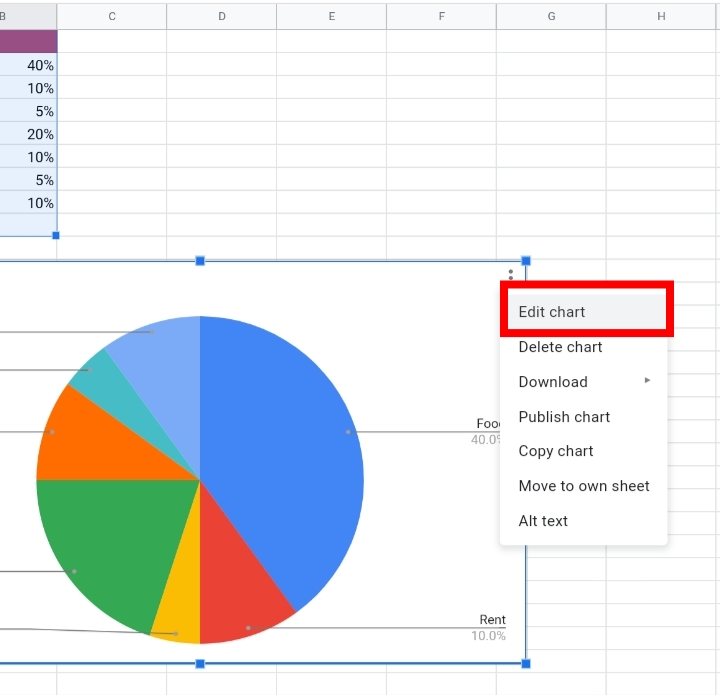
Step 1: Click three dots on the top right corner of the pie chart.
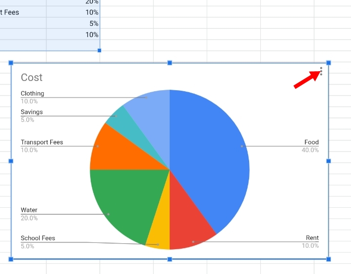
Step 2: Click on Edit Chart. The chart editor tab appears on the right side of the worksheet. You can also double click on the pie chart to activate the chart editor tab.
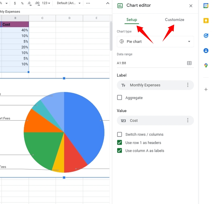
The chart editor comprises two categories which are:
- Setup – This section consists of the Chart type, Data range and Label. In case you were given a different chart, you would change it into a pie chart using the Chart type option.
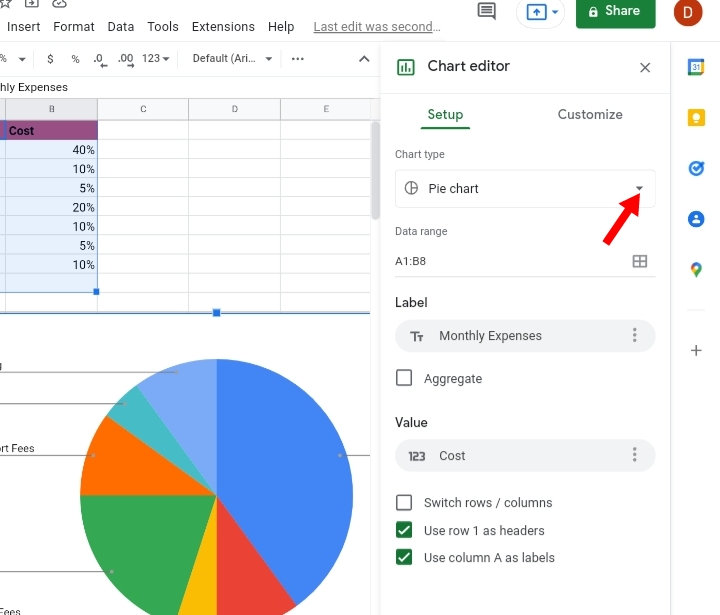
Click on the drop-down arrow and select the pie chart.
- Customize- This section is responsible for editing the aesthetics, fonts, colors, order and arrangement of the values displayed in the pie chart.
Changing Data Range.
If you want an extra cell or data displayed on your pie chart, you edit the data range.
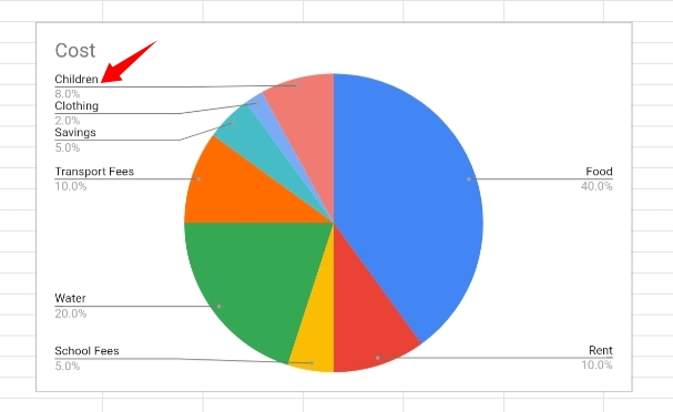
For instance, we want to add values in cells A9 and B9 into the selected range, A1 to B8.
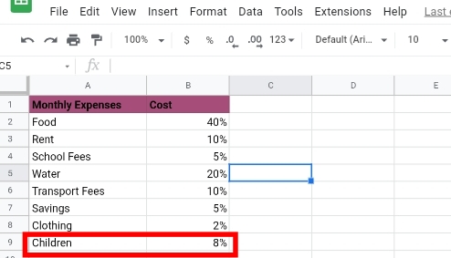
Once the new values are entered, the pie chart automatically adjusts to the new data and adds them as a part of the pie chart.

Alternatively:
Step 1: Go to the Chart Editor tab.
Step 2: Click on the Setup tab.
Step 3: Click on the Data range here and input the new cell range which is A1:B9
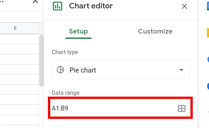
Step 4: Click Enter and the pie chart automatically includes the extra data into the diagram.
Changing the Label on your Pie Chart.
The label is the title or category the values fall under. This is because labels are added when there are more types of values displayed in the pie chart.
Since we have only two categories of data, it is not a necessity for the pie chart. But if you need to add a label to your pie chart, here are the steps required.
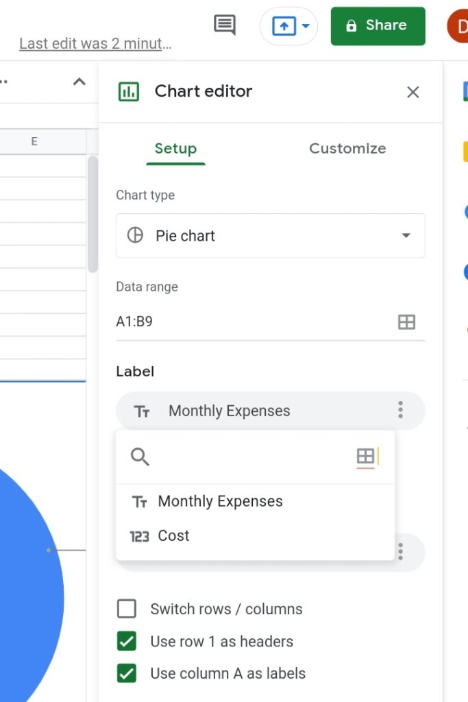
- Go to the Chart Editor tab.
- Under Setup, click on Label.
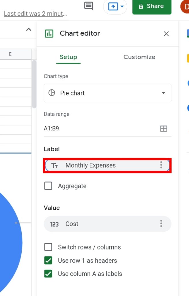
- Select the title of your label. It is based on the headers on the worksheet. You can select either header.
Customizing the Aesthetics of The Pie Chart.
This is designing your pie chart to how you want it to look. Under the Customize tab, you can change the color of the slices, font size, font style, add a legend, add a 3D effect and several others.
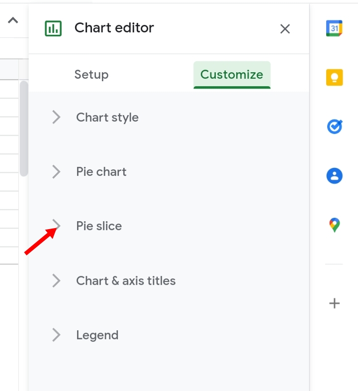
Step 1: Click on Customize under the Chart Editor.
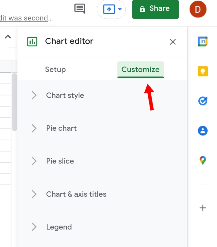
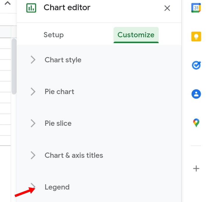
Step 2: A list of edit features is displayed. It includes
- Chart Style.
- Pie Chart.
- Pie Slice.
- Chart axis and Titles.
- Legend.
These are the major components that customize and create effects on a pie chart.
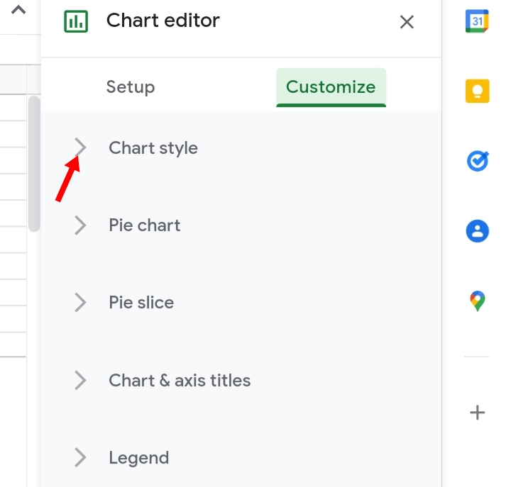
Changing Chart Style of A Pie Chart.
Here, we are going to discuss how to change the Chart style. This is the first component of the Customize tab.
Step 1: Click on the drop-down arrow close to the Chart Style option.
Step 2: The components that make up the Chart style feature are started below.
Step 3: With these options, you can change the background color of your pie chart, add border color to the chart, and change the font style of the values in the pie chart.
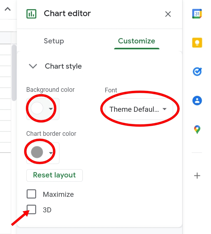
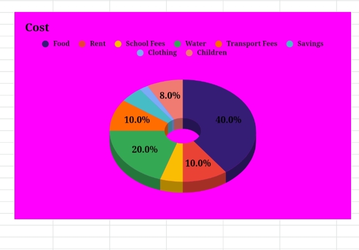
In addition to this, you can also add a 3-D effect to improve the visually and dimensions of the pie chart.
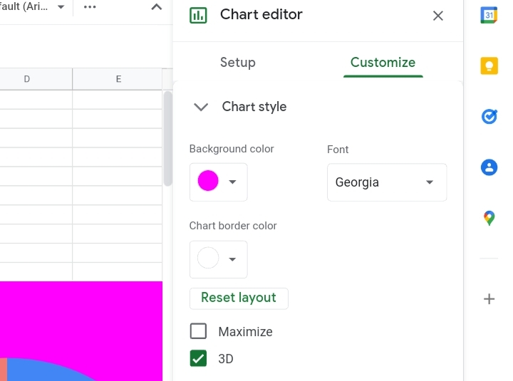
It makes the pie chart look solid and realistic.
Changing Pie Slices of A Pie Chart.
Sometimes, when we want to emphasize and give reference to a particular section of the pie chart we use the Pie slice feature to separate that particular section from the rest of the data.
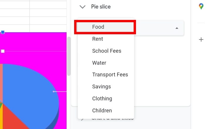
Step 1: Click on the Pie Slice option under the Customize tab in the Chart Editor.
Step 2: Other options are listed there. Click on the drop-down arrow here.
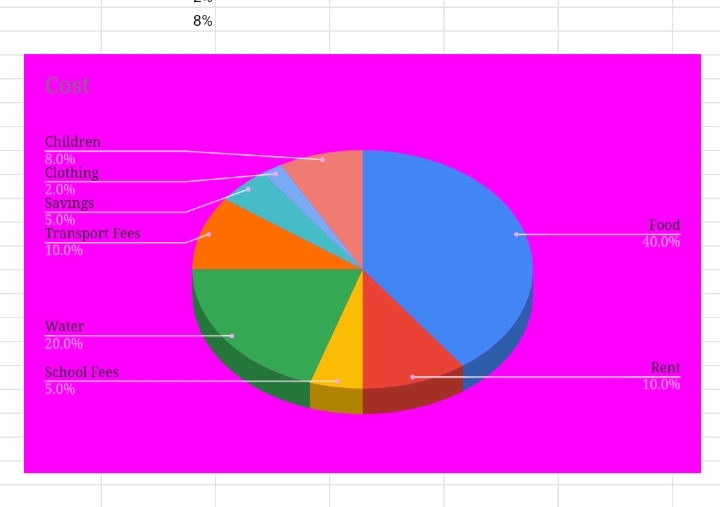
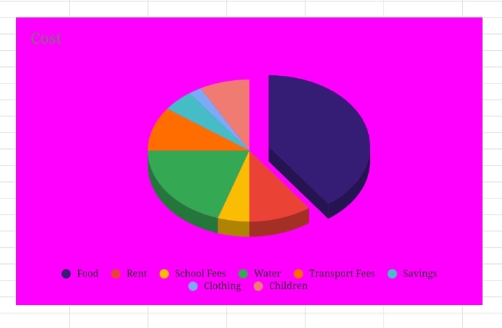
Step 3: Select the category you want to be highlighted and separated from the main chart. For example, we want the Food category to stand out, so we select Food.
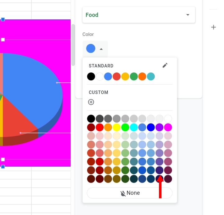
Step 4: You can also change the color into a brighter or darker color to give enough emphasis to the selected category.
Step 5: Select the extent of how far you want it from the center of the Pie Chart. So I typed in 20%. This separates the category by twenty per cent.
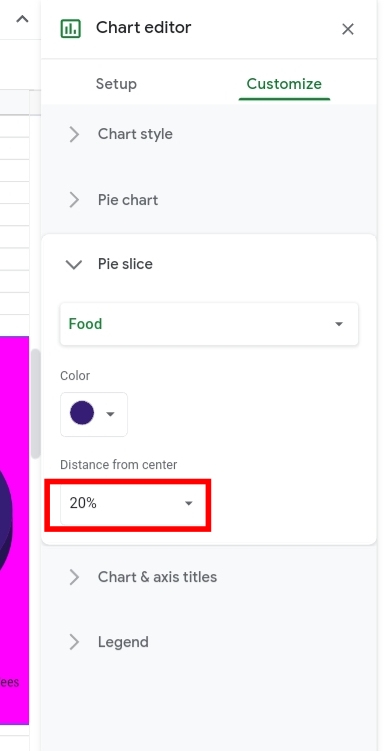
Step 6: Click Enter. The selected category becomes highlighted and stands out from the rest of the data in the pie chart.
Customizing the Pie Chart Option.
Another feature under the Customize tab is the Pie Chart.
Step 1: Click on the drop-down arrow close to the Pie Chart.
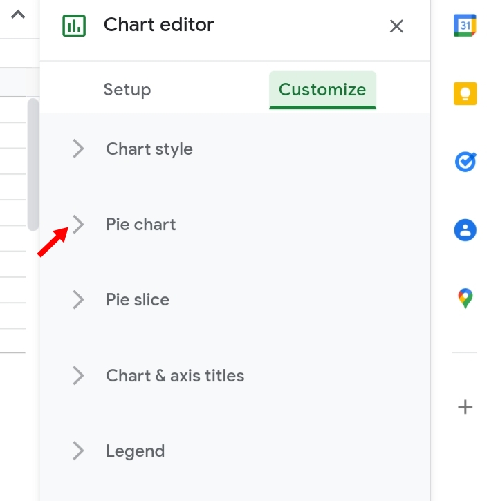
Step 2: A list of options is also provided below.
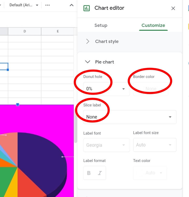
Here, you can change your pie chart to a donut chart, increase the size of the donut, add a label to the slices, and edit the font size, style and color.
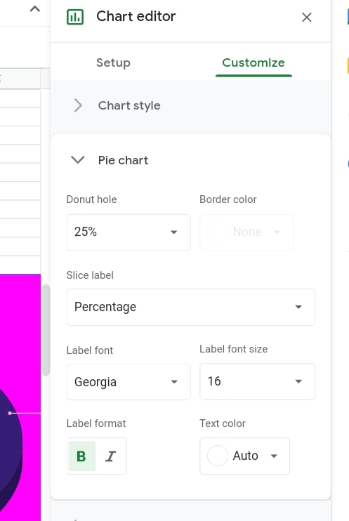
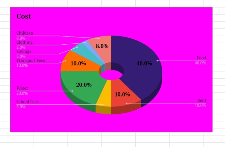
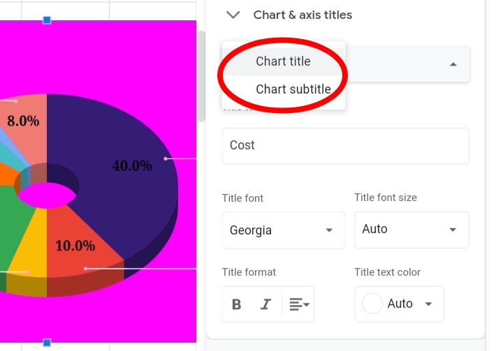
Chart Axis and Titles.
Here, we can change the titles and subtitles of the pie chart, and change its font, font style, size and title.
Adding A Legend.
On a pie chart, a legend is the arrangement of the categories stated in the pie chart, illustrating their titles along with their represented colors on the pie chart.
Step 1: Go to the Chart Editor.
Step 2: Under the Customize tab, Click on Legend.
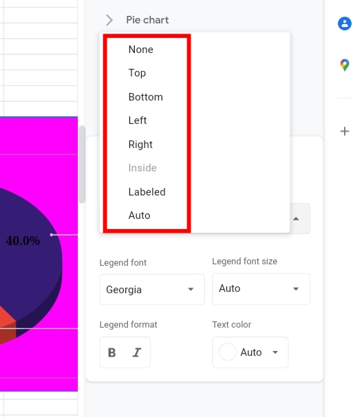
Step 3: Here, you can select how you want the titles arranged.
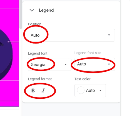
The legend is at the right but you can change it to be anywhere on the chart, top, bottom, left or right. Its font size, format and text color.
Conclusion:
Although Pie charts aren’t the best option for displaying numerous data as the collision of colors might make the illustration confusing and disorderly, it remains a great way of representing data graphically.
Now, you also know How to Create a Pie Chart in Google Sheets of your own. Thank you for reading.


