Google Sheets has made data entry and storage very efficient for its users. Data entered are placed in cells and columns in the worksheet but you may want your data displayed differently.
There are several types of charts and graphs which are used to illustrate your dataset graphically. These charts are very helpful with data analysis, variation and deduction.
Amongst these graphs are the bar graph and this is what we are going to discuss in this guide. Here, I will show you how to create and customize a bar graph in google sheets.
How To Create A Bar Graph In Google Sheets.
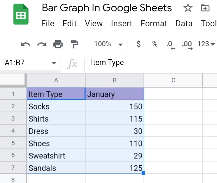
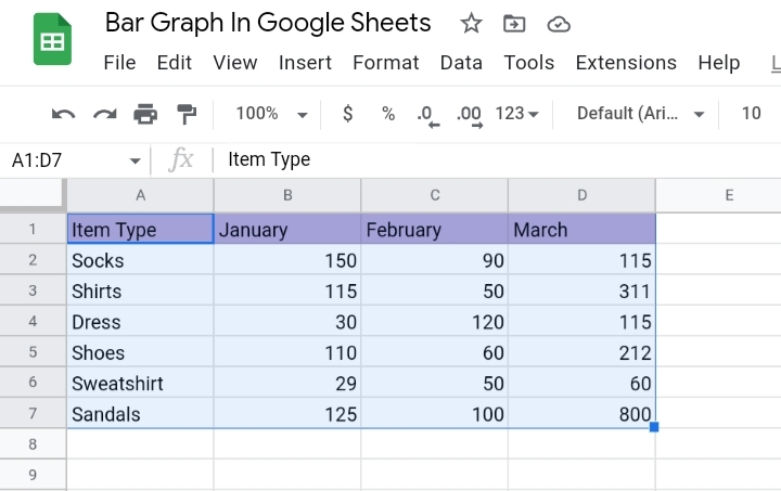
Let’s start with a simple dataset. Here, we have a sample dataset with some items sold in January. To create a bar chart, you would need to follow the steps stated below.
1. Select the cell range of the dataset, and ensure the header rows are included.
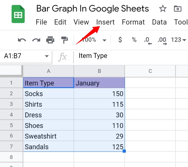
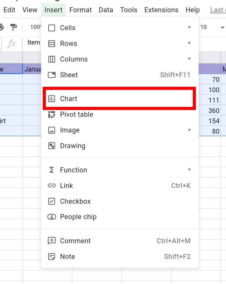
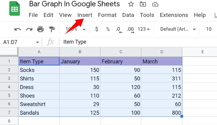
2. Navigate your way to the toolbar and click on Insert.
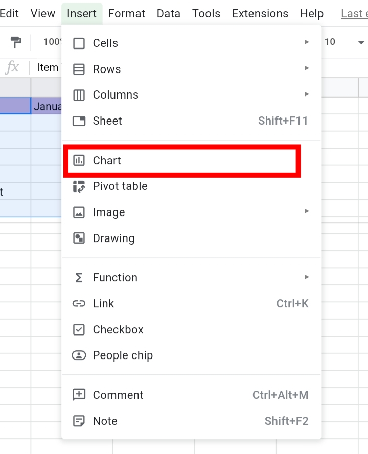
3. From the drop-down list, select Chart.
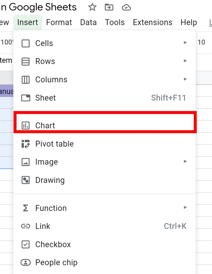
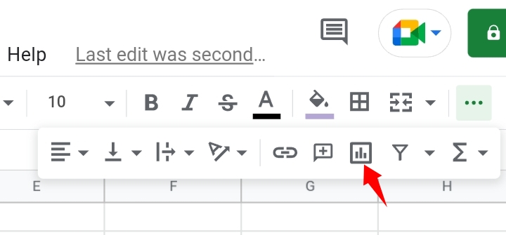
Alternatively, you can click on the Insert Chart icon on the far right of the toolbar.

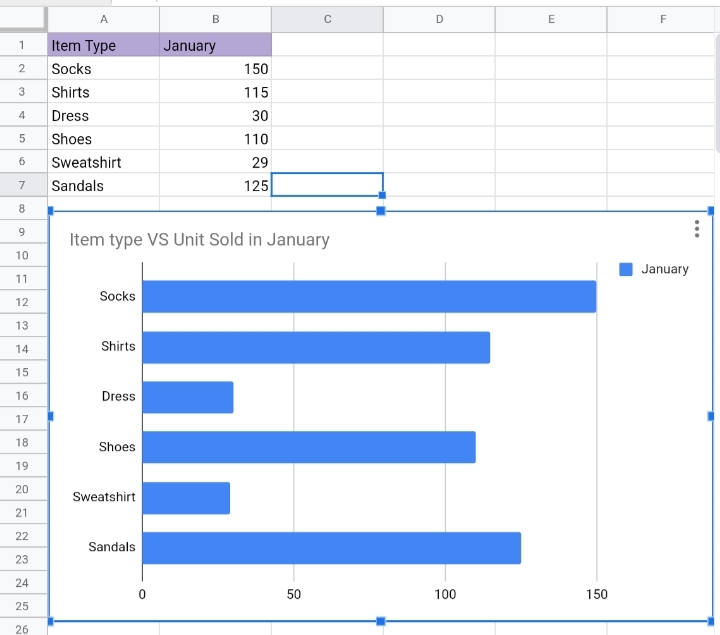
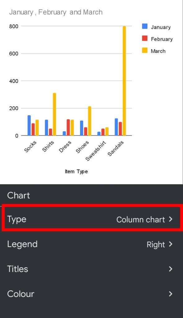
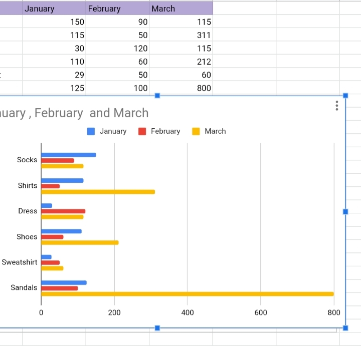
4. Google sheets automatically guesses what type of chart you want to use, based on your data and creates a custom bar graph for you.
On rare occasions, Google sheets might insert a different chart for you. This can be changed by editing the chart.
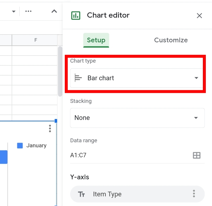
In case you are given a different chart, you can change it under the Chart Editor tab.
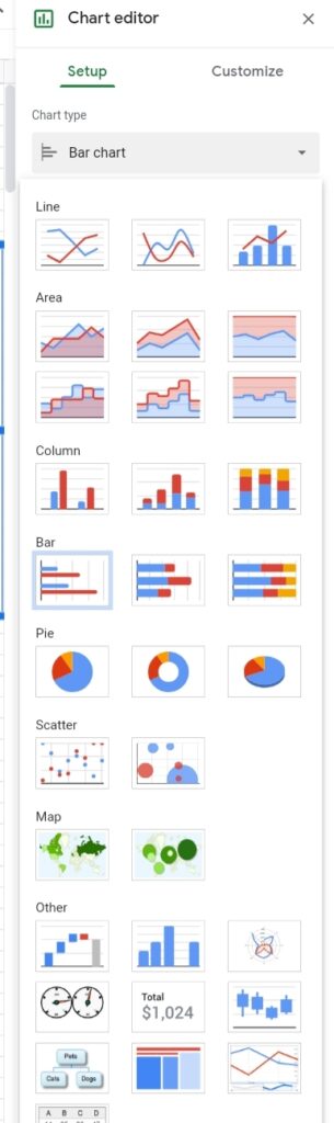
1. Click on Setup under the Chart Editor tab.
2. Click on Chart type. Here, you can select a bar graph.
That’s all. You have successfully created a bar graph.
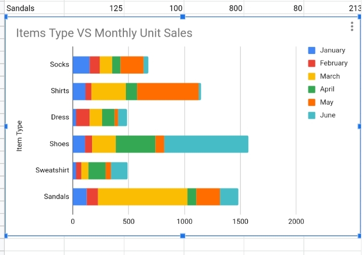
How to Make a Stacked Bar Graph on Google Sheets
A stacked bar graph is used when you have multiple values in the dataset.
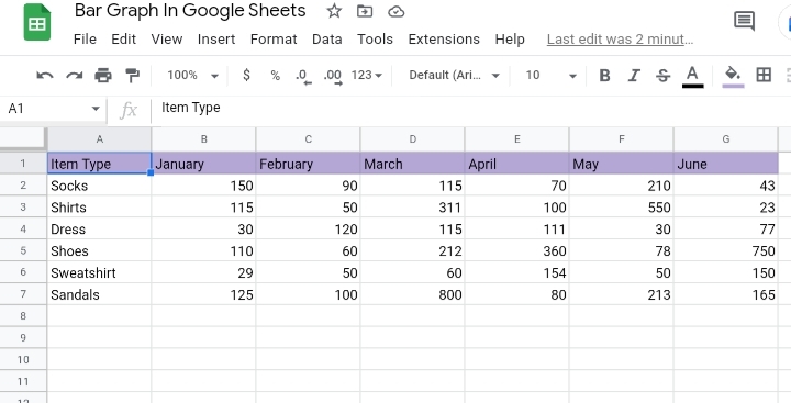
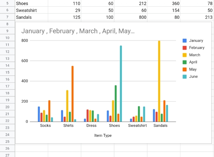
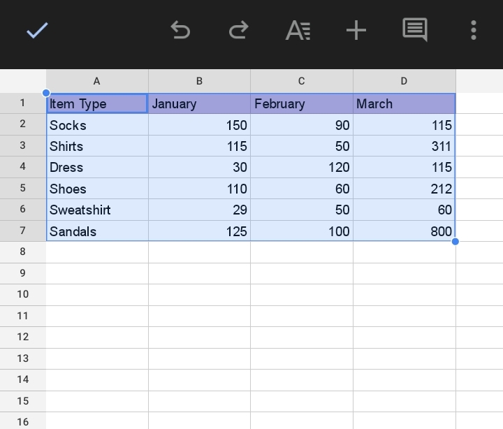
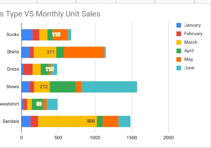
Here, we have a sample dataset with some items sold and their monthly sales from January to June.
We want to use a bar graph to visualize the variation and difference between monthly sales.
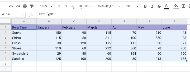
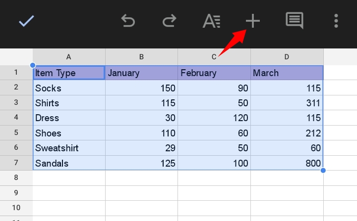
1. Select the cell range of the dataset, and ensure the header rows are included.
2. Navigate your way to the toolbar and click on Insert.
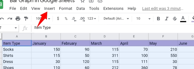
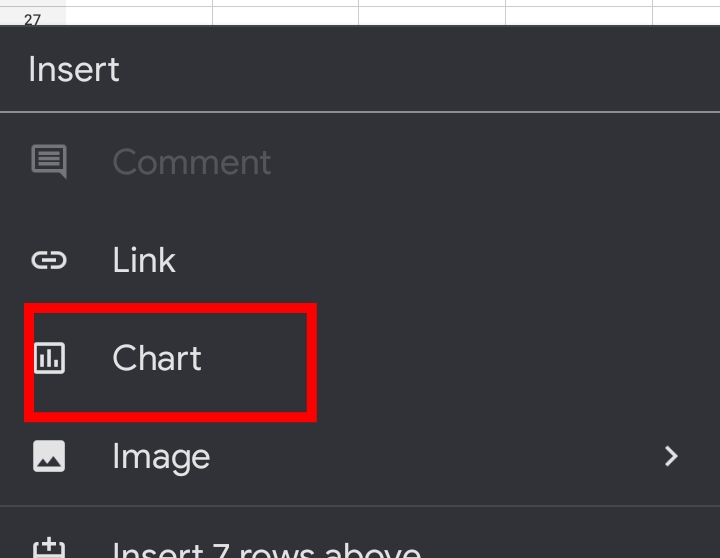
3. From the drop-down list, select Chart.
Alternatively, you can click on the Insert Chart icon on the far right of the toolbar.
Step 4: Google sheets automatically guesses what type of chart you want to use, based on your data and creates a stacked bar graph for you.
On rare occasions, Google sheets might insert a different chart for you. This can be changed by editing the chart.
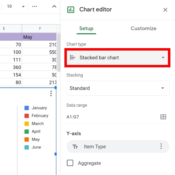
In case you are given a different chart, you can change it under the Chart Editor tab.
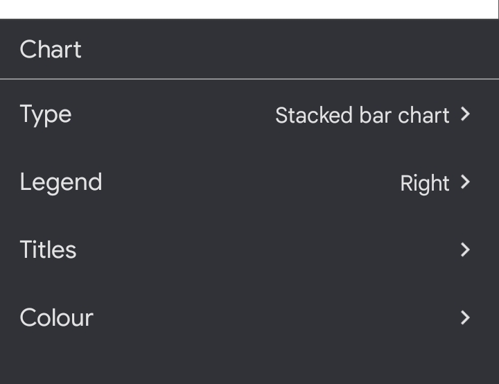
Step 1: Click on Setup under the Chart Editor tab.
Step 2: Click on Chart type. Here, you can select a Stacked bar graph.
A Stacked bar graph would be inserted on your worksheet.
How To Make A Bar Graph In Google Sheets Mobile App
You can also insert a bar graph on your worksheet through the Google Sheets app on mobile devices and tablets. This is done in the following steps.
1. Select the cell range of the dataset, and ensure the header rows are included.
2. Click on Insert. It looks like a plus sign (+) icon on the toolbar.
3. From the options provided, select Chart.
4. Google sheets suggest a type of chart to use, based on your data and creates a bar graph for you.
On rare occasions, Google sheets might insert a different chart for you. This can be changed by editing the chart.
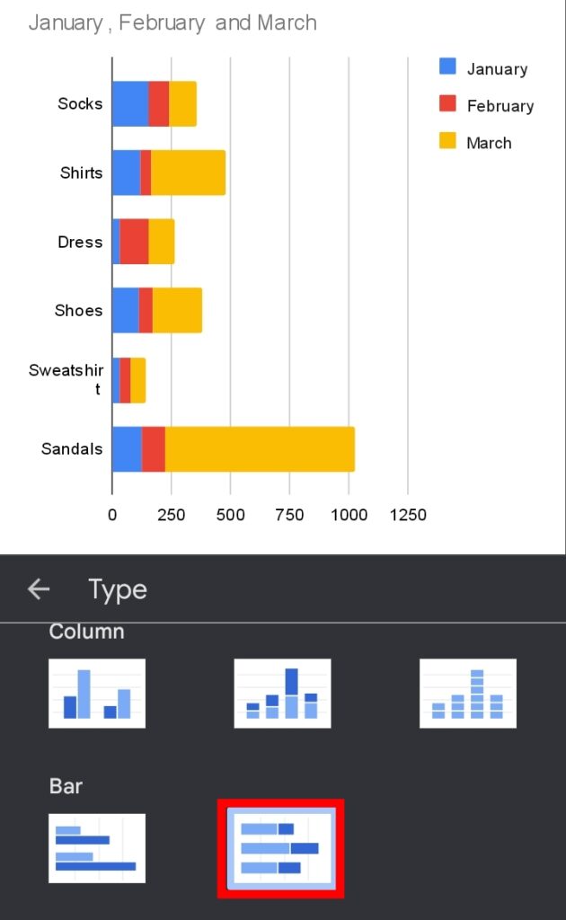
5. You can edit your Chart type, Legends, Series, Horizontal and Vertical axis etc. in the tab here.
And that’s it! From the comfort of your mobile device, you can create an accurate bar graph in Google Sheets.
How to Label a Bar Graph in Google Sheets.
After you create a bar graph, you can edit and customize the labels of the bar graph to increase the clarity and visibility of your worksheet.
To do this, simply follow these steps.
1. Open the Chart Editor by double-clicking the chart.
2. Click Series. For the sample worksheet, I’ll select each month from January to June.
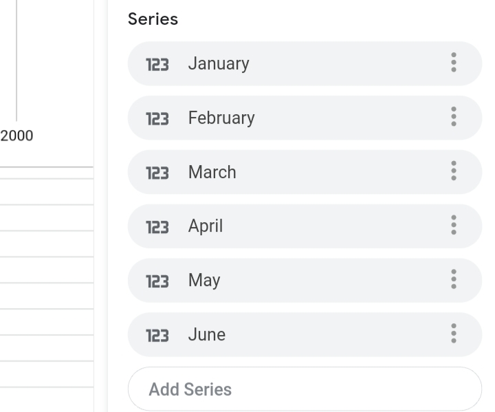
3. Click on Add Labels, then enter a cell range from the current dataset to act as the label. Here, I selected the “March” cell range as the label.
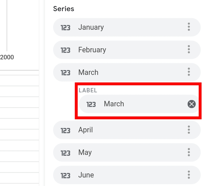
The March labels are added to the graph.
How to Change a Visualization of Bar Graph in Google Sheets
If you want to change your bar graph’s visualization, you would open the chart Editor and select the Chart Type option.
Here, there are different forms of graphical representation. It could be a chart, graph or map. Select any one of your choice to change the visualization in Google Sheets.
Customizing The Bar Graph.
This is designing your bar chart to how you want it to look. Under the Customize tab, you can change the color, font size, font style, add legend, and several others.
1. Click on the Customize tab under the Chart Editor.
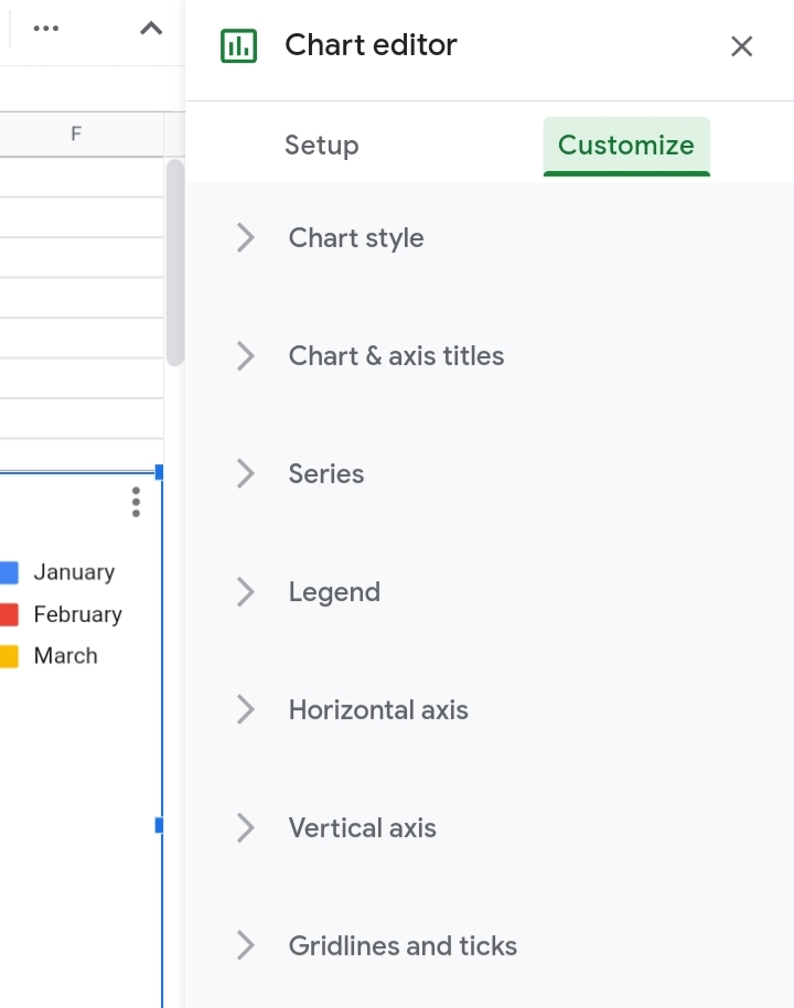
2. A list of edit features is displayed. It includes
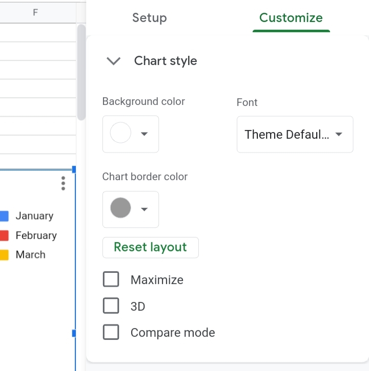
- Chart Style: Here, you can change the graph’s format such as font style, font size, border size, text color etcetera.
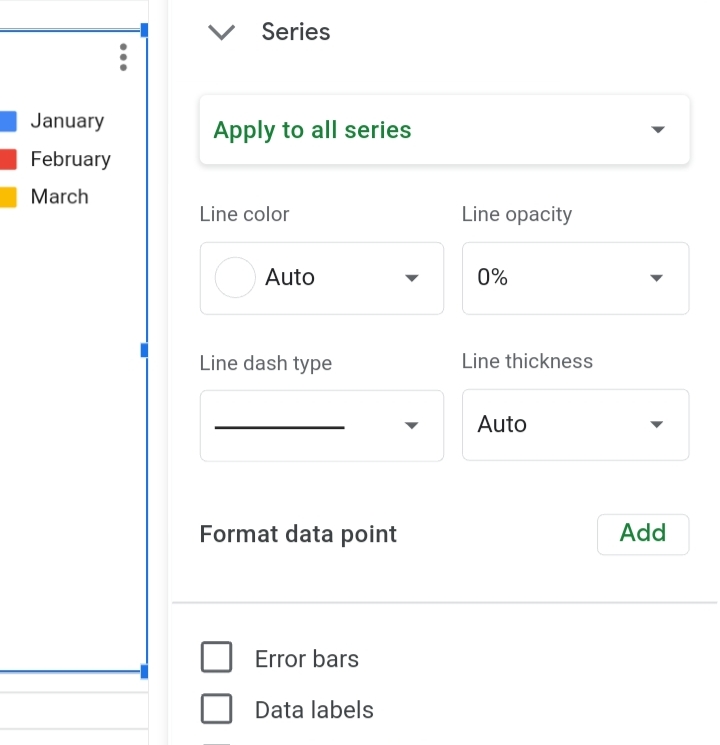
- Series: This is where you edit the bar’s colors and the series of the bars. You can also add error bars and data labels.
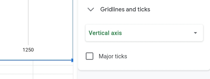
- Gridlines: Here, you can choose to add or remove grid lines and ticks into the bar graph.
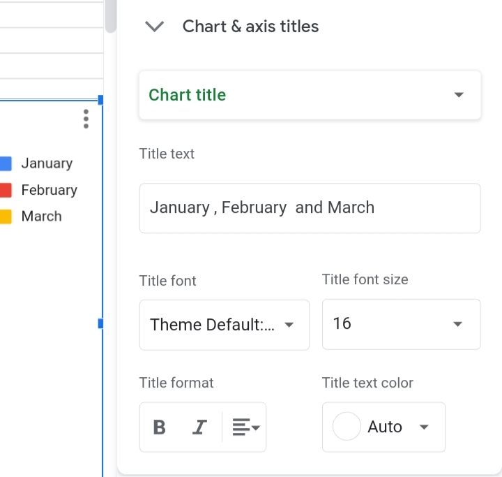
- Chart axis and Titles: Here, you can change the chart title, subtitles, axis titles and format.
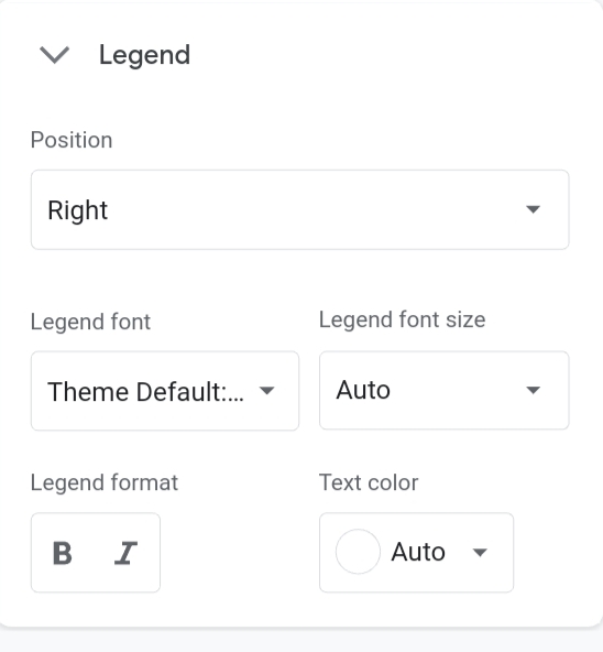
- Legend: You can adjust the position of the headers in the bar chart. It is most suitable for a bar graph with multiple series.
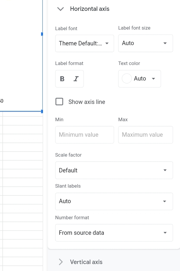
- Horizontal and Vertical Axes: Here, you can change the label, its format and the size of the horizontal and vertical axes. Also, the minimum and maximum values of the graph can be edited here. You can also switch the values and positions of the horizontal and vertical axes.
How To Delete A Bar Graph In Google Sheets
This is as easy as creating a bar chart. Deleting a bar graph is done in the following steps.
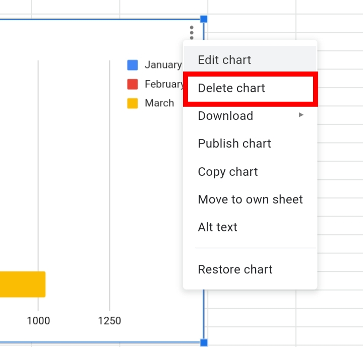
1. Click on the three dots arranged vertically at the top right corner of the worksheet.
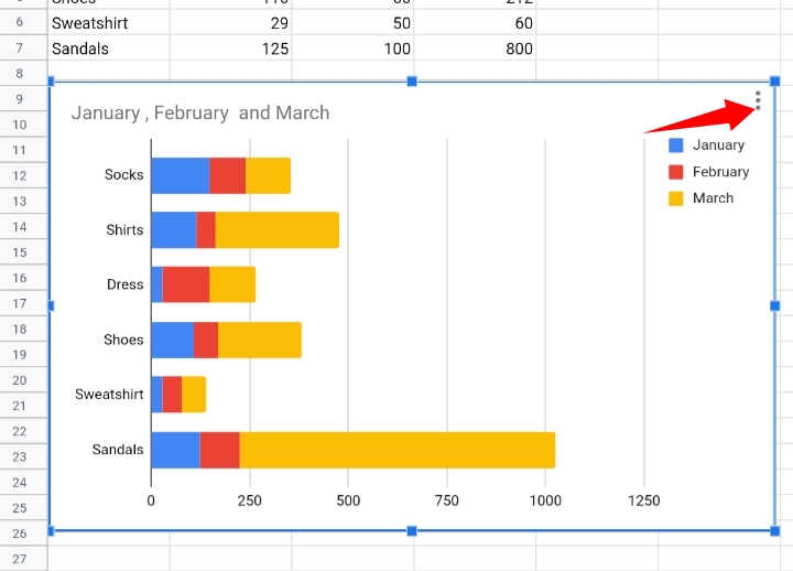
2. From the list of options provided, click on Delete Chart.
The bar graph is automatically removed from the worksheet.
Why Use A Bar Graph In Google Sheets?
A bar graph helps to turn data into a simple format where you can extract information and understand the relationship and variation between the subjects in the worksheet.
Frequently Asked Questions on How To Make A Bar Graph In Google Sheets (FAQs).
What’s the Difference Between a Column Graph and Bar Graph in Google Sheets?
Column graphs and bar graphs are somewhat similar with the presence of rectangular bars in their general format.
Also, there are great ways of representing data graphically. The only difference between the two graphs is the position of the rectangular bars.
Bar graphs have their bars placed horizontally on the vertical axis as they run across the horizontal axis. Column graphs have their bars placed upright on the horizontal axis, as they illustrate the dataset from bottom to top.
Once I Create a Bar Graph, How Do I Change the Titles, Legends, Series, Etc.?
You can adjust and make these changes via the Chart Editor.
To open the Chart Editor, you can either double click your bar chart or click on the three dots arranged vertically at the top right corner of the bar chart.
From the list of options provided, click on Edit Chart.
For more information and details on how to change the titles, legends, series and all other sections of your bar chart, you can read the Customizing Bar Graph section of this guide.
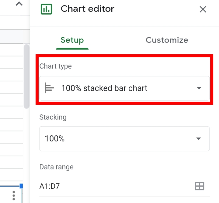
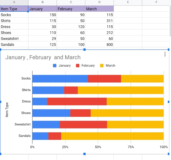
How To Make A Bar Graph With Multiple Columns.
A bar graph with multiple columns is a 100% Stacked Bar Graph.
1. Select the cell range of the dataset, and ensure the header rows are included.
2. Navigate your way to the toolbar and click on Insert.
3. From the drop-down list, select Chart. Alternatively, you can click on the Insert Chart icon on the far right of the toolbar.
4. Google sheets guesses what type of chart you want to use, based on your data and automatically creates a bar graph for you. On rare occasions, Google sheets might insert a different chart for you. This can be changed by editing the chart.
In case you are given a different chart, you can change it under the Chart Editor tab.
1. Click on Setup under the Chart Editor tab.
2. Click on Chart type. Here, you can select a 100% Stacked bar graph.
A 100% Stacked bar graph would be inserted on your worksheet.
Final Thoughts
So this is all you need to know about creating and customizing a bar graph in Google Sheets.
Now you know How To Make A Bar Graph In Google Sheets and how to edit and modify it as well, I hope this guide comes in handy when you need it. Thanks for reading.


