Google Sheets provides several charts and graphs that are used to illustrate your dataset graphically and display the variation and relationships between the values in your worksheet.
Amongst these graphs is the organizational chart. This chart is used to depict the relationship of multiple values to a single value in a hierarchical form.
It is used to display the relationships between family members or office staff with the use of nodes that represent each member in the chart and lines that represent the connections between them.
Due to the multiple relationships between each member, creating an organizational chart manually is a long process and may waste time.
In this guide, we will discuss how to create and customize an organizational chart in Google Sheets.
Data For An Organizational Chart
The organizational chart has a unique feature that displays the connection between multiple values to a single value at the top of the chart.
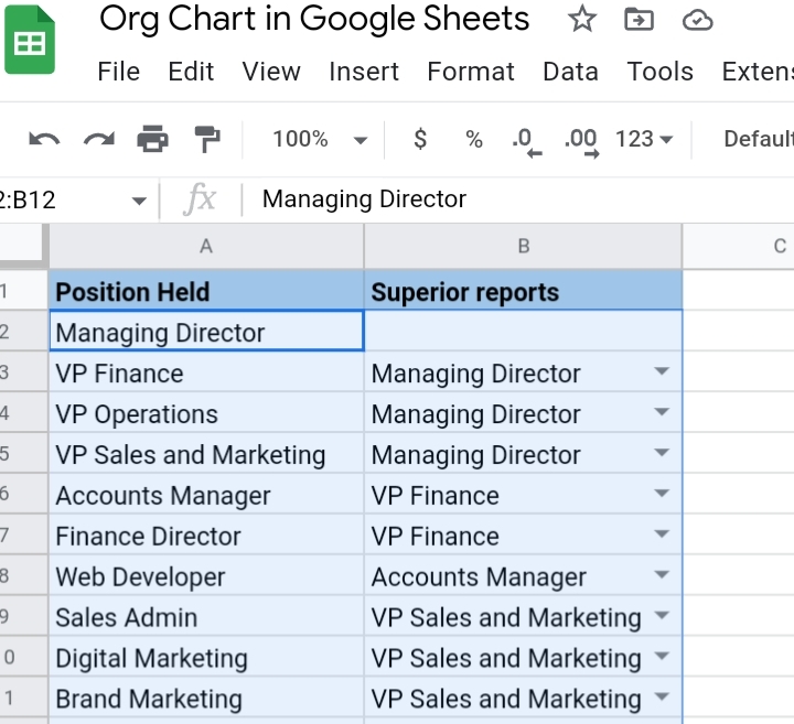
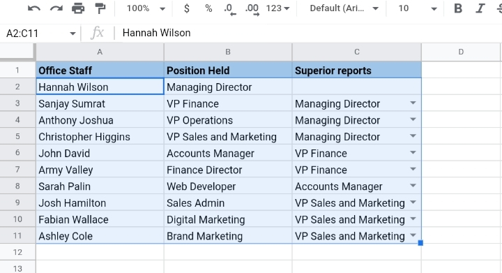
In the sample worksheet below, we have two columns with the positions held in the office and the superior reports.
In column B with the superior reports, we would create a drop-down list with the use of data validation because the values in this column are subject to change over time.
1. Highlight the rows in column B from cell B3:B11.
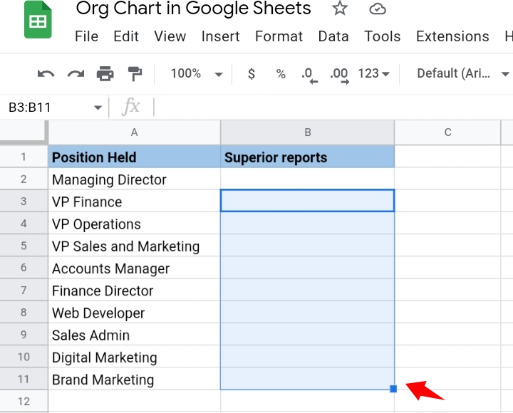
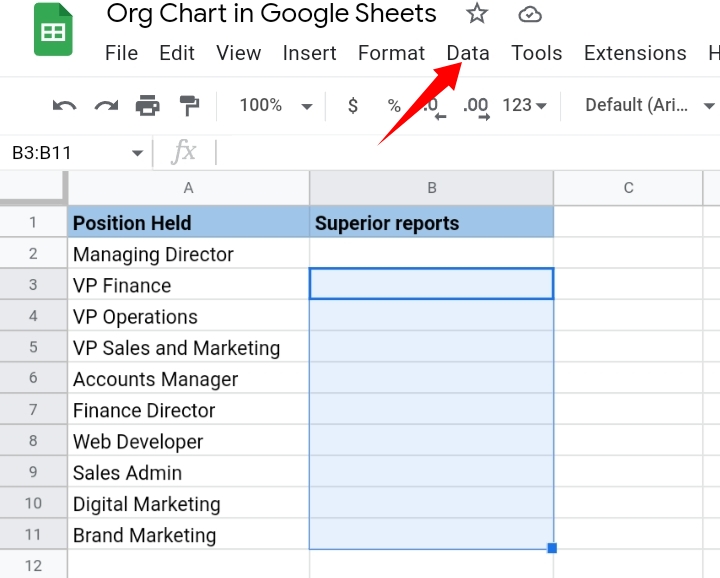
2. Go to the toolbar and click on Data.
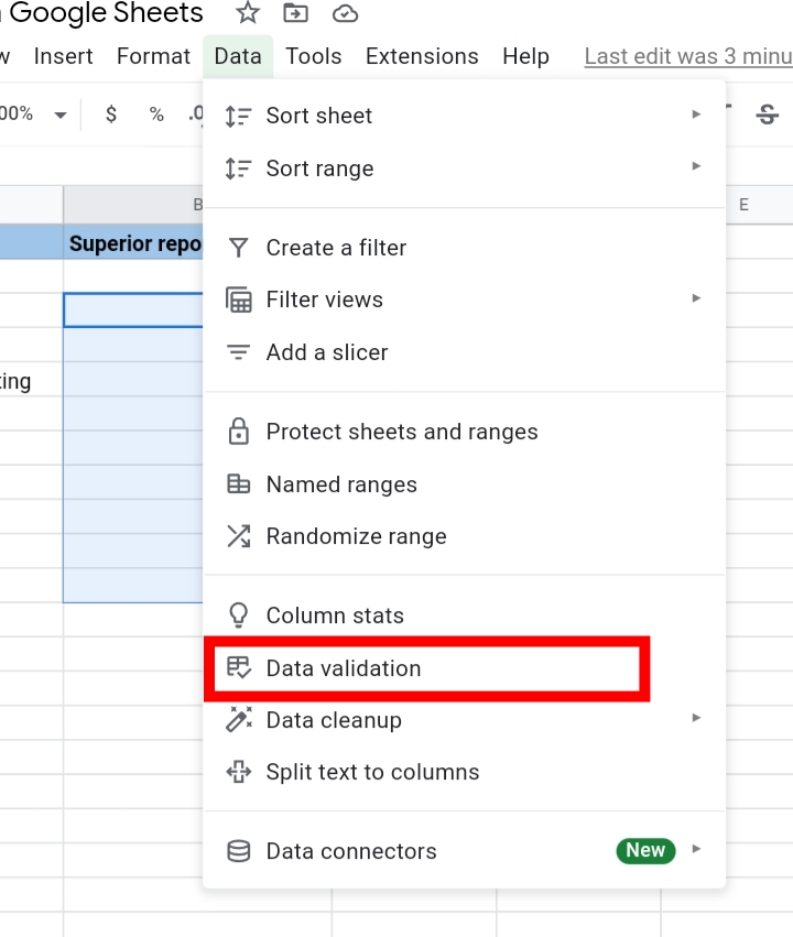
3. From the drop-down menu provided, select Data Validation.
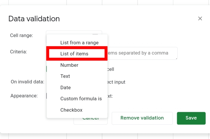
4. In the Data Validation tab opened, in the Criteria tab, select List of Items.
5. In the textbox provided, enter the positions of the office staff, each word separated by a comma.
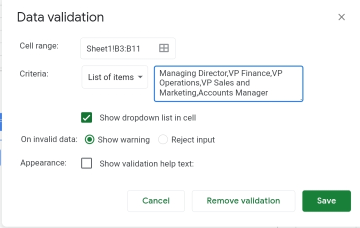
6. Click the Save button to save the validation. Drop-down arrows are placed in the cells of the Superior report column.
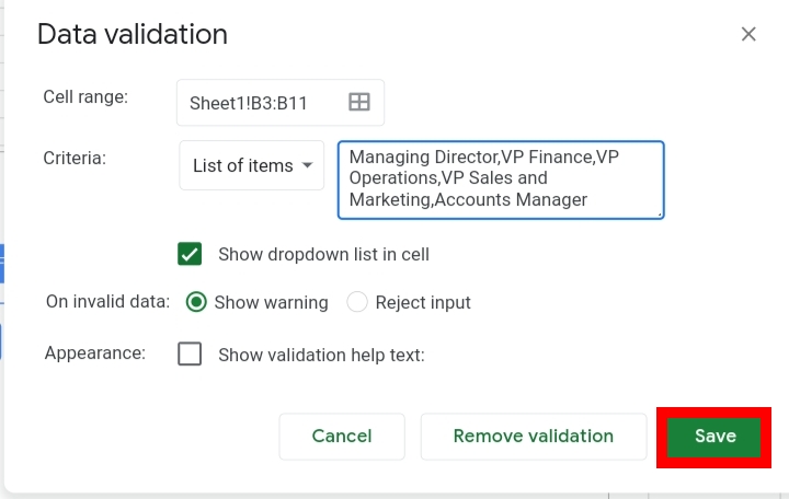
7. Click on the implanted arrows and select the positions you want in the column. Exclude the name that would be at the top of the organizational chart.
Now our dataset is fully prepared. Next, we create the organizational chart to display the relationships between the individuals.
How To Make An Organizational Chart In Google Sheets
With the data prepared above, we would create an organizational chart. To do this, we need to follow the steps stated below.
1. Select the dataset.
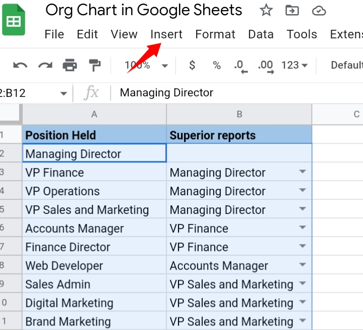
2. Go to the toolbar and select Insert.
3. From the drop-down list displayed, select Chart or click on the Insert Chart icon on the toolbar.
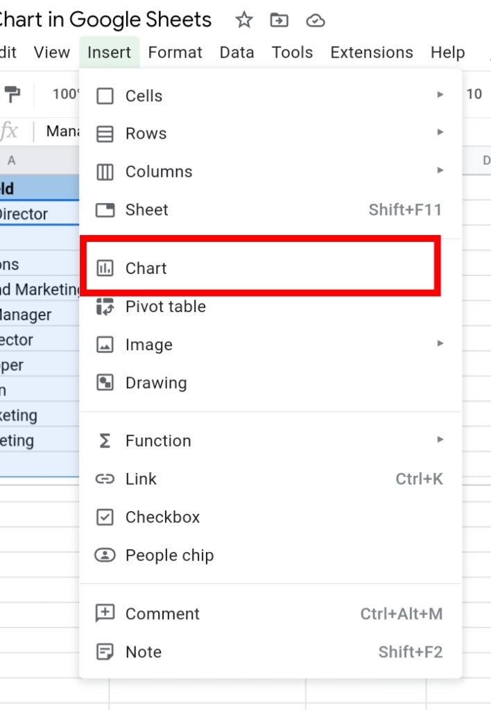
4. If Google Sheets doesn’t provide an organizational Chart, open the Chart Editor and select Chart type under the Setup tab.

5. Select the Organizational Chart there.

6. Scroll down and click the ‘Use Row 1 as headers’ checkbox.
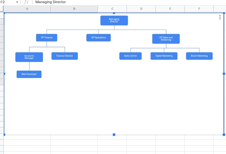
An organizational chart would be inserted into your worksheet. If any name is changed in the dataset, the chart adjusts and accommodates the new changes made in the worksheet.
How To Add Names to the Organizational Chart
After you’ve created an organizational chart, you may want to add names to the positions held in the chart. There are three methods to insert this.
Showing Names as Tooltips
This method requires an additional column where the names of the office staff would be entered so if your dataset doesn’t have such a column, ensure you insert one.
When a name is added, if you hover your cursor on the node with a position held, the name is displayed at the top of the node.
If you are about to insert a name column, place it in the first column of your dataset or the last column of your dataset. This makes it easier to create the tooltips.
To create an organizational chart with name tooltips, follow the steps stated below.
1. Select the dataset.
2. Go to the toolbar and select Insert.

3. From the drop-down list displayed, select Chart or click on the Insert Chart icon on the toolbar.
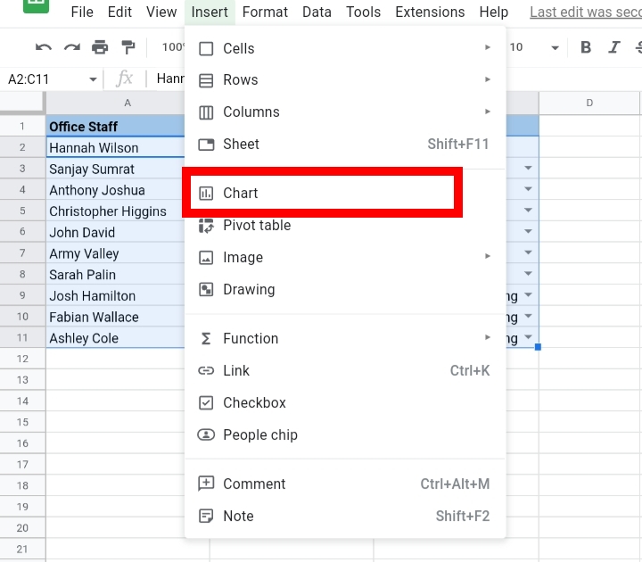
4. If Google Sheets doesn’t provide an organizational Chart, open the Chart Editor and select Chart type under the Setup tab.

5. Select the Organizational Chart there.

6. Scroll down and select the checkbox beside ‘Use row 1 as headers.
Looking directly at the organizational chart, the names of the office staff aren’t displayed here until you hover your cursor on a node. The position held by the staff is displayed.
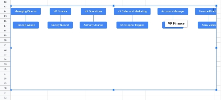
This method doesn’t require any additional steps to create as it is created with the same steps used to create a regular organizational chart and it also provides more information about the position held.
If you decide to download the organizational chart as an image or pdf file, the name tooltips won’t be displayed on the organizational chart.
Adding Name as the Part of the Dataset
This method involves the addition of the name along with the position held in the same column.
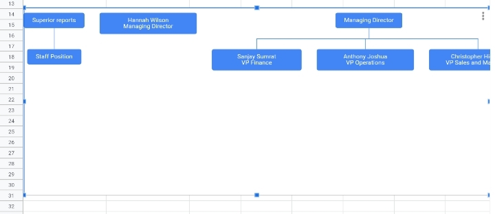
In the dataset below, we have the names of the workers and their held positions in column A. I inserted line breaks into the cells so that the nodes on the organizational chart won’t be long.
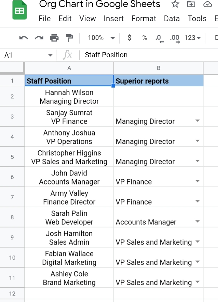
To do this, you need to follow the steps stated below.
1. Select the dataset.
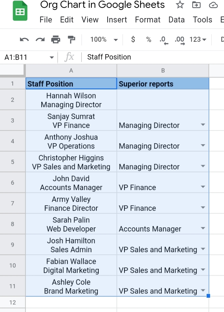
2. Go to the toolbar and select Insert.

3. From the drop-down list displayed, select Chart or click on the Insert Chart icon on the toolbar.
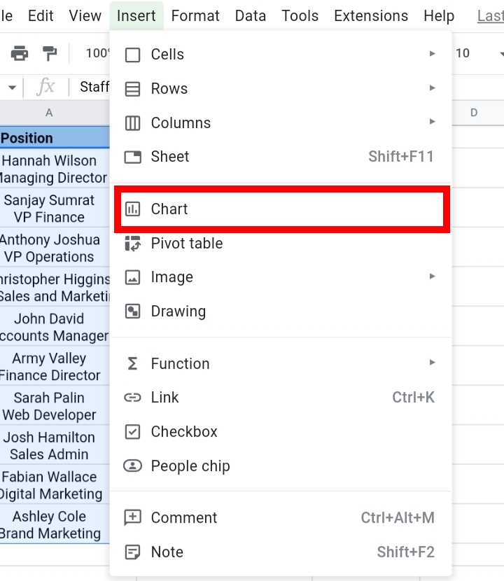
4. If Google Sheets doesn’t provide an organizational Chart, open the Chart Editor and select Chart type under the Setup tab.
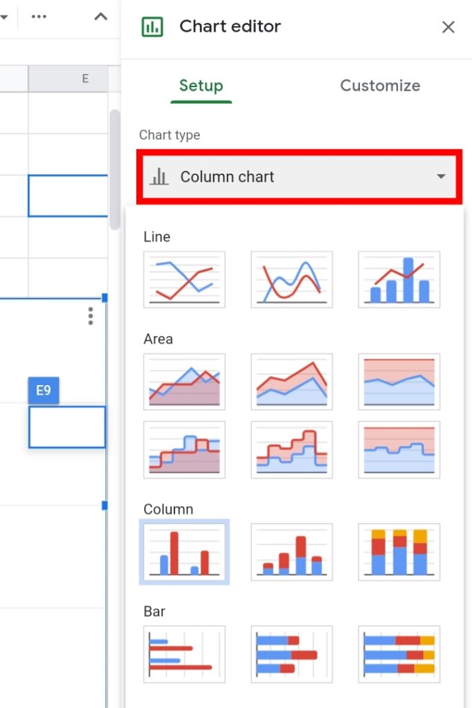
5. Select the organizational Chart there.

6. Scroll down and select the checkbox beside ‘Use row 1 as headers.
The organizational chart created has the names of each staff and their staff positions in each node of the chart.
How to Add Names to an Organization Chart Using CONCATENATE Function
This is the third method used to add names to an organizational chart. Here, we have the names and positions in separate columns but we want the two values in a single column.
We could insert line breaks manually with the Ctrl + Enter shortcut keys but this could take a while if you have a wide dataset.
So, I’m going to show you a faster method with the use of the CONCATENATE function.
The CONCATENATE function is used to join two or more text strings together in one cell. To do this, you would use a combination formula which contains the CONCATENATE and CHAR functions.
Let’s proceed. In the worksheet below, we have the names, their positions held and their superior reports in columns A, B and C respectively. Then, I created another table in column E where the results would be entered.
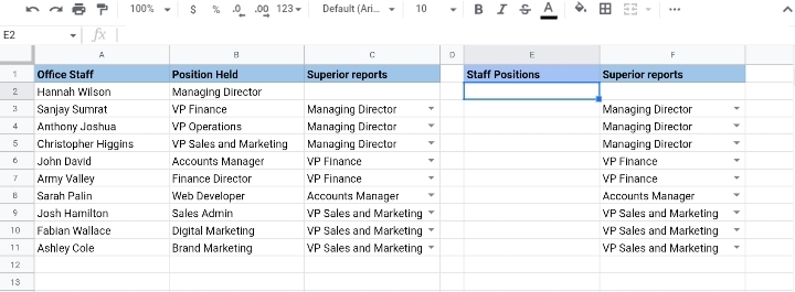
1. Click on cell E2 and enter the formula, =CONCATENATE( A2, CHAR(10), B2)
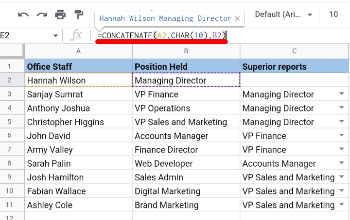
2. Hit the Enter key to return the joint text string in cell E2. The cell automatically adjusts to contain the text string to prevent overflow into column F.
3. Drag down the fill icon cube to copy the formula and paste the results into the other cells below.
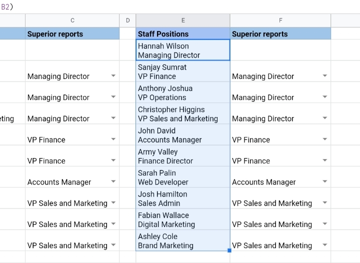
4. The table is ready now and can be used to create an organizational chart.
To create an organizational chart, you can follow the steps stated below.
1. Select the dataset.
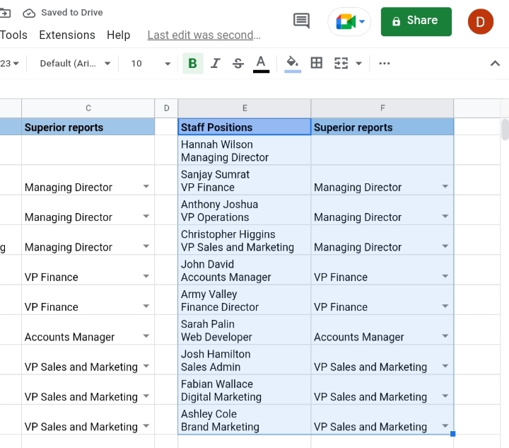
2. Go to the toolbar and select Insert.

3. From the drop-down list displayed, select Chart or click on the Insert Chart icon on the toolbar.

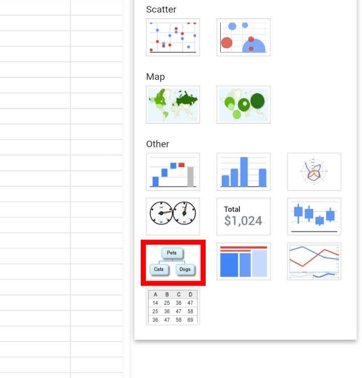
4. If Google Sheets doesn’t provide an organizational Chart, open the Chart Editor and select Chart type under the Setup tab.

5. Select the organizational Chart there.
6. Scroll down and select the checkbox beside ‘Use row 1 as headers.
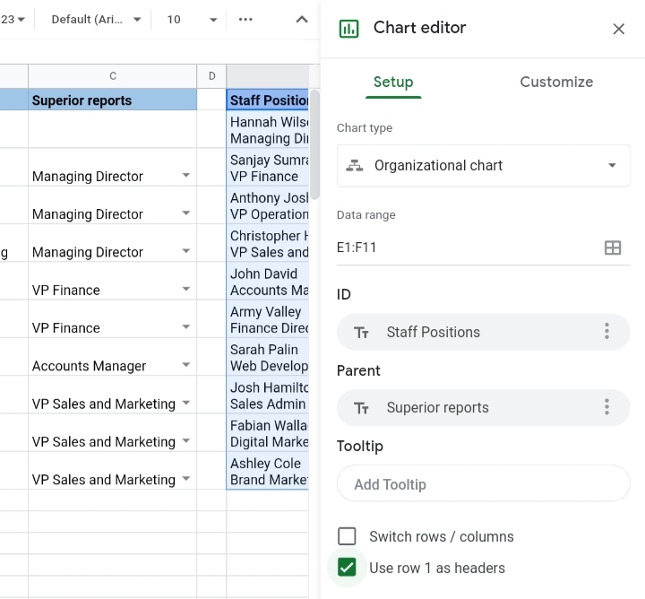
The organizational chart created has the names of each staff and their staff positions in each node of the chart.
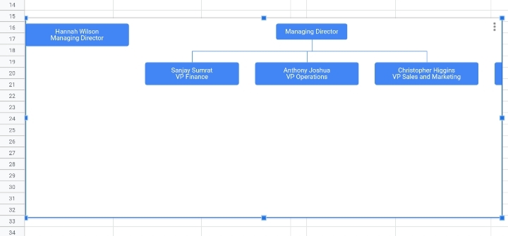
How To Customize An Organizational Chart In Google Sheets
After you’ve created an organizational chart and you are not satisfied with the default settings made on your chart, you can customize the aesthetics and features of your organizational chart.
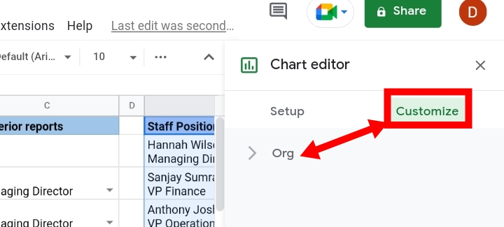
To do this, you have to open the Chart Editor and go to the Customize tab.
How to Change the Size of the Text of the Organizational Chart
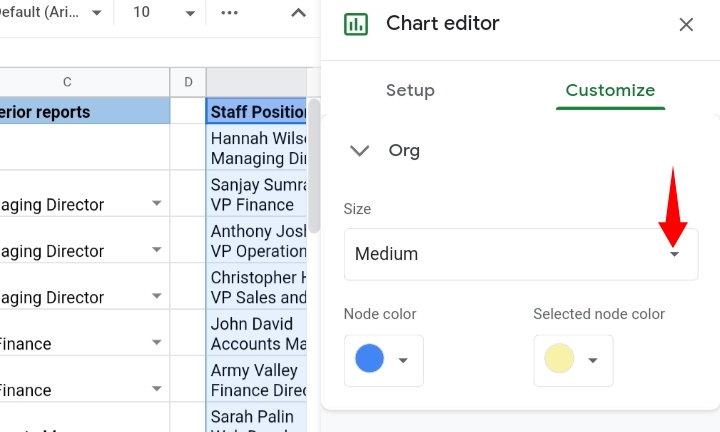
To change the size of the text of the organizational chart, you would follow these steps.
1. Open the Chart Editor by double-clicking your chart.
2. Under the Customize tab, click Org.

3. Click on the dropdown arrow close to the Size section.
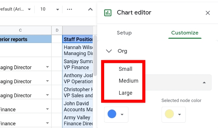
4. There are three options provided. They are: Small, Medium and Large. You can select the size of your choice.
How to Change the Color of the Nodes of the Organizational Chart
If you don’t like the default color selected for you by Google Sheets, you can also change the color of the nodes.
To do this, you have to follow these steps:
1. Open the Chart Editor by double-clicking your chart.
2. Under the Customize tab, click Org.
3. Click on the dropdown arrow close to the Node color section.
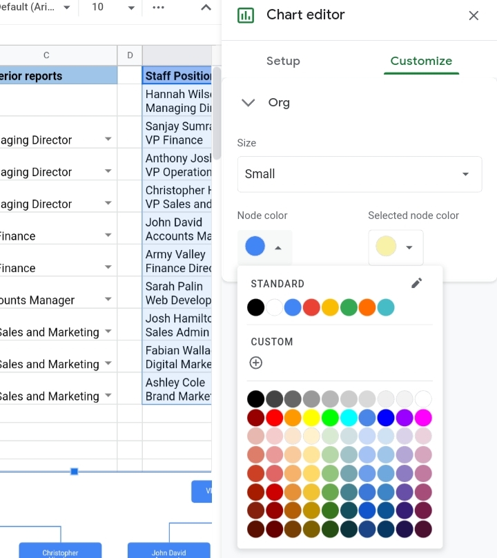
4. Select your color of choice. The color of the nodes of the org chart are changed accordingly.
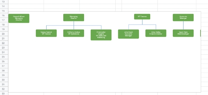
How To Download the Organizational Chart from Google Sheets as Image or PDF
It’s great that you can finally create an organizational chart but what happens when you need your chart in a hardcopy or as a part of a journal or report?
Well, don’t fret over it. You can download your organizational chart as a PNG or PDF file in a matter of seconds.
To do this, you have to follow the steps stated below.
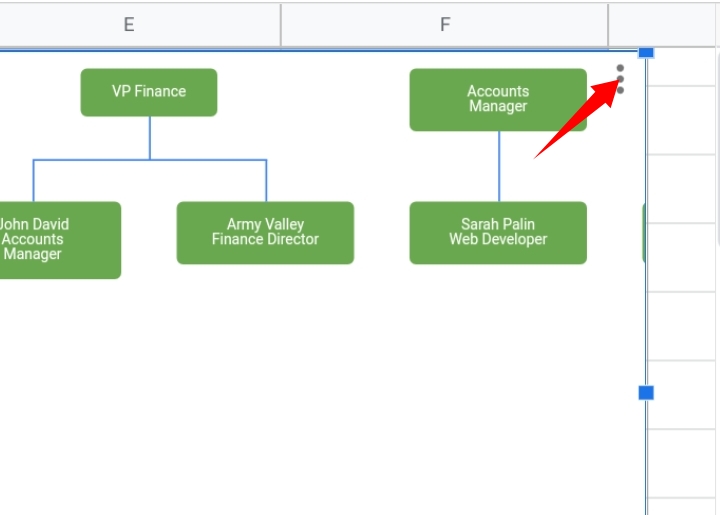
1. Go to your organizational chart and click on the three dots arranged vertically in the top right corner of the chart.
2. From the list of options provided, click on Download.
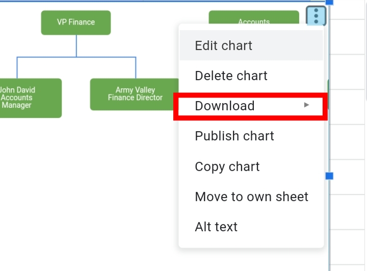
3. Then, select the preferred download format, either PNG or PDF.
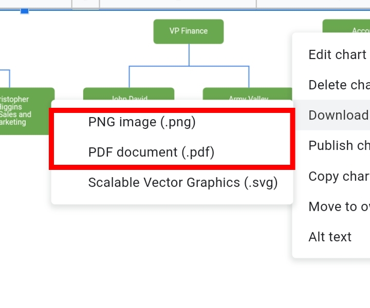
Your organizational chart would be downloaded instantly in your preferred format.
After download, check out how to print this chart.
Final Thoughts
This guide has covered all you need to know about creating an organizational chart in Google Sheets.
An organizational chart would be very helpful in illustrating a detailed hierarchy plan of your dataset.
I hope you found this guide helpful. Thanks for reading 🙂


